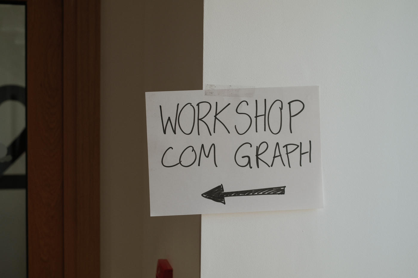
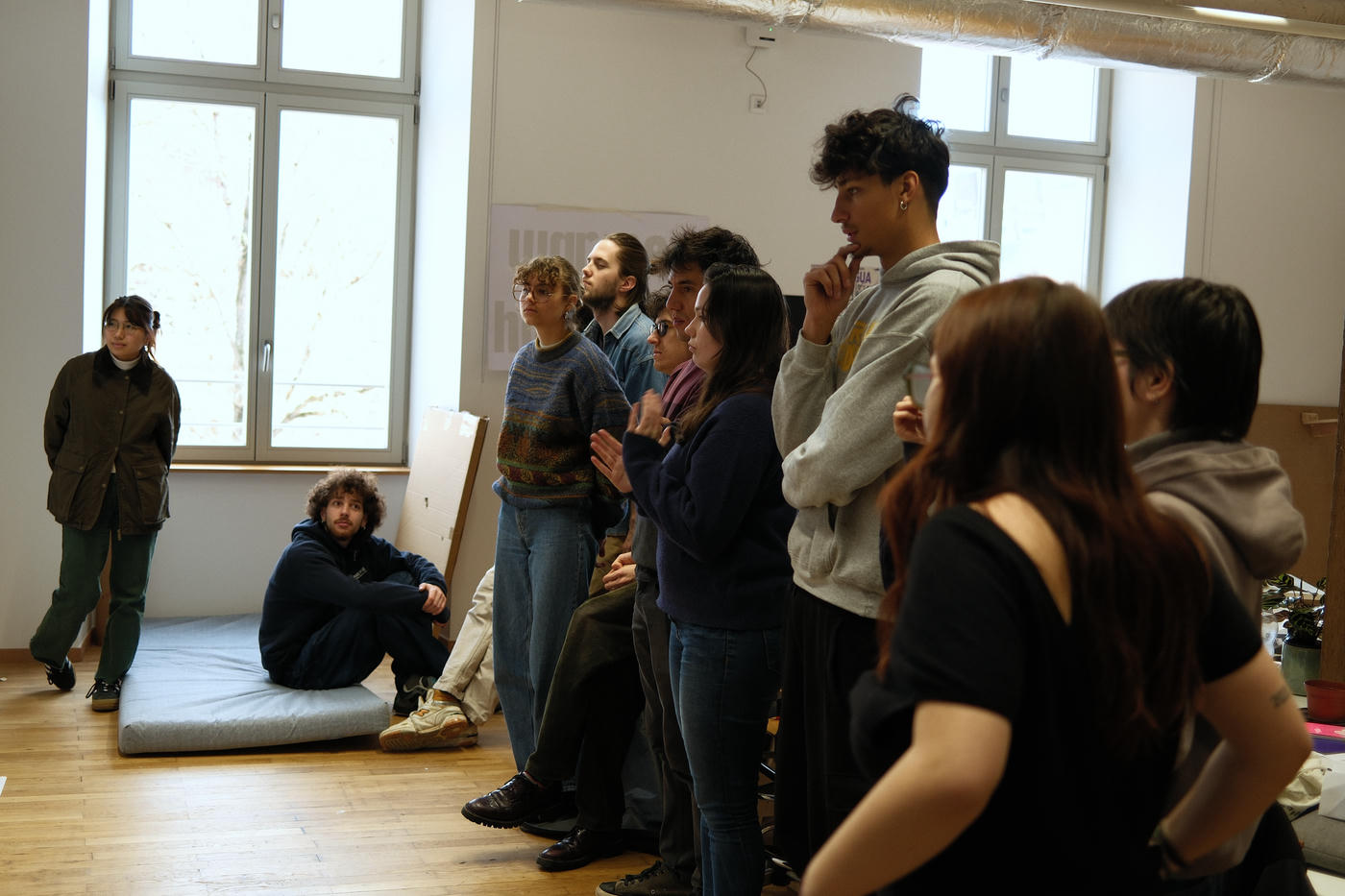
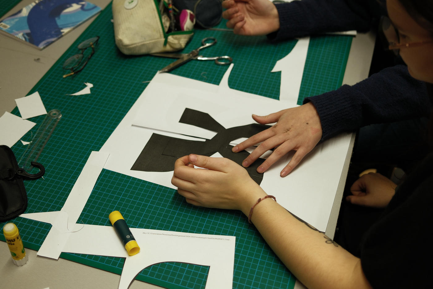
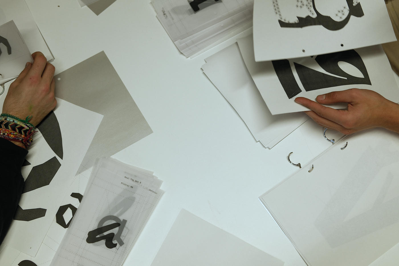
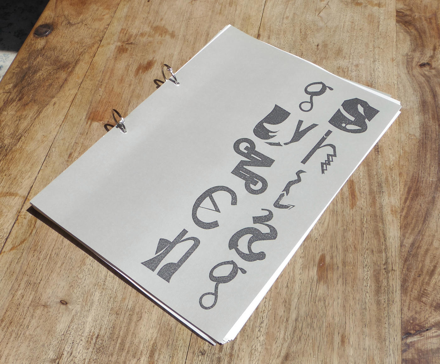
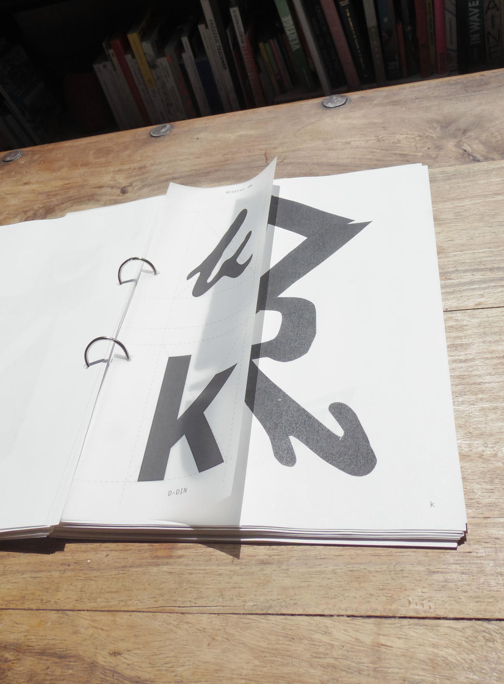
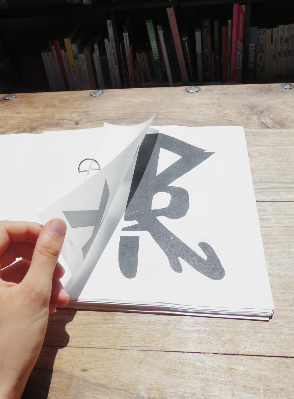
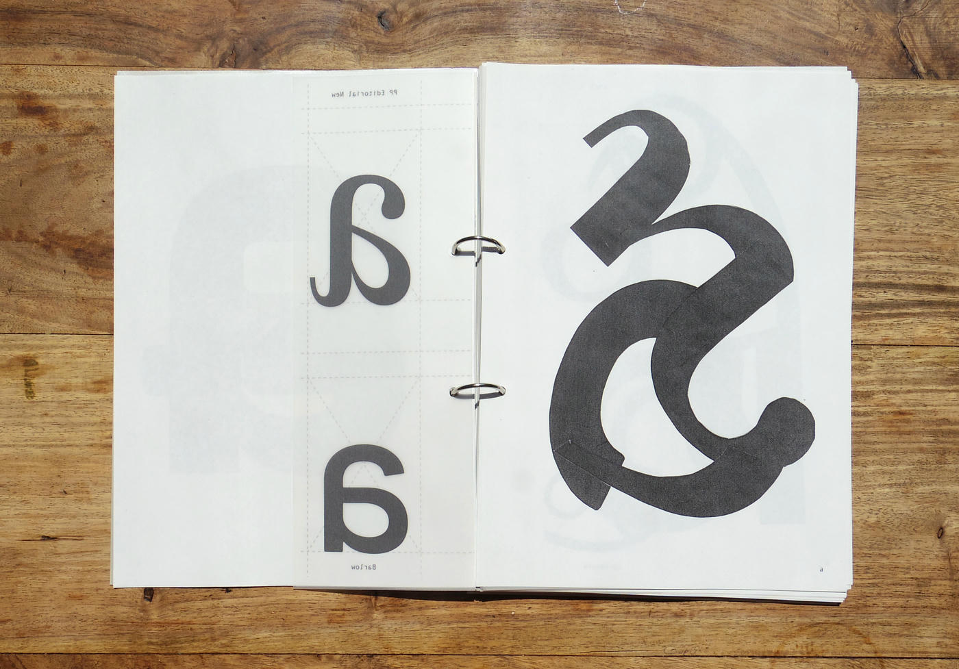
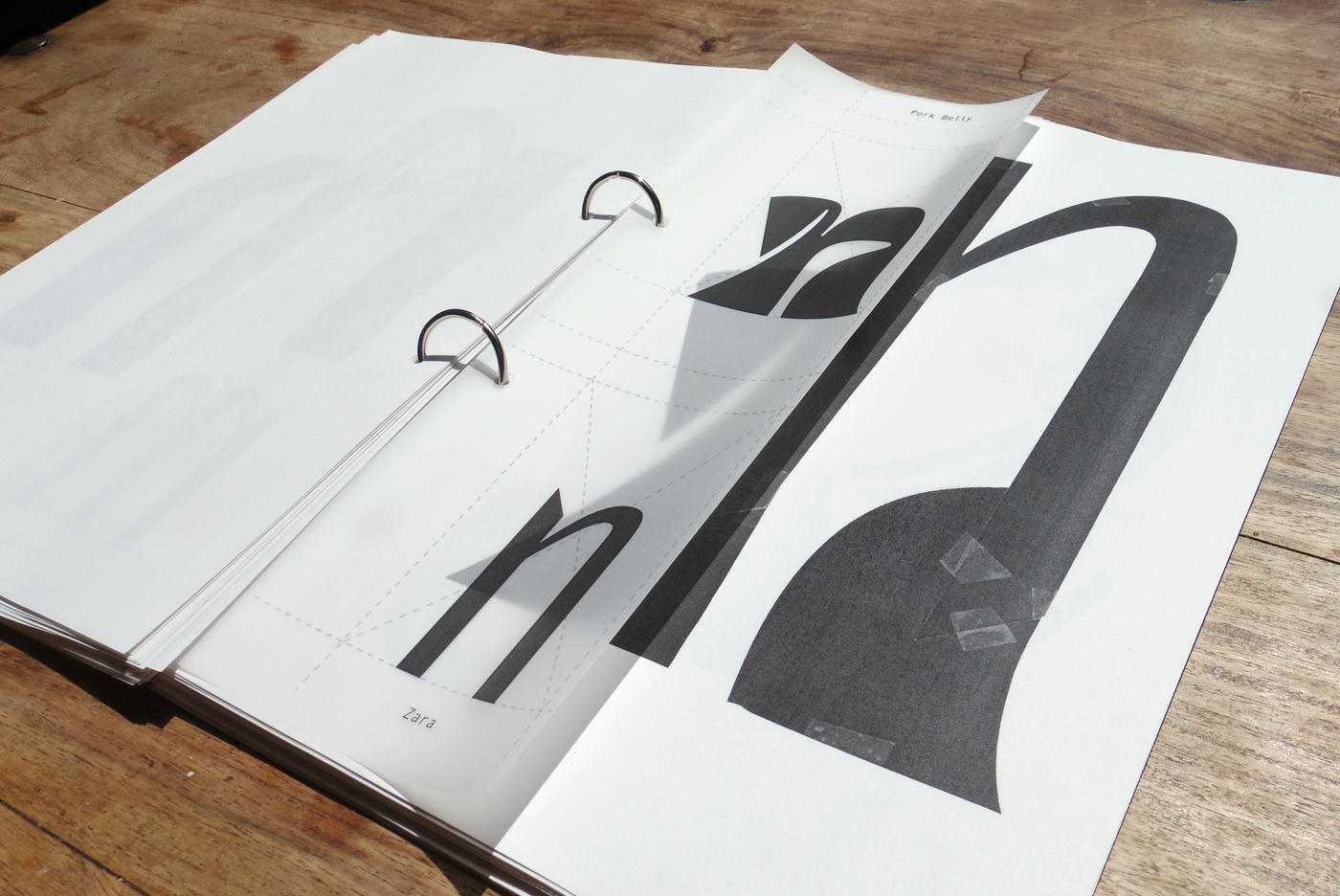
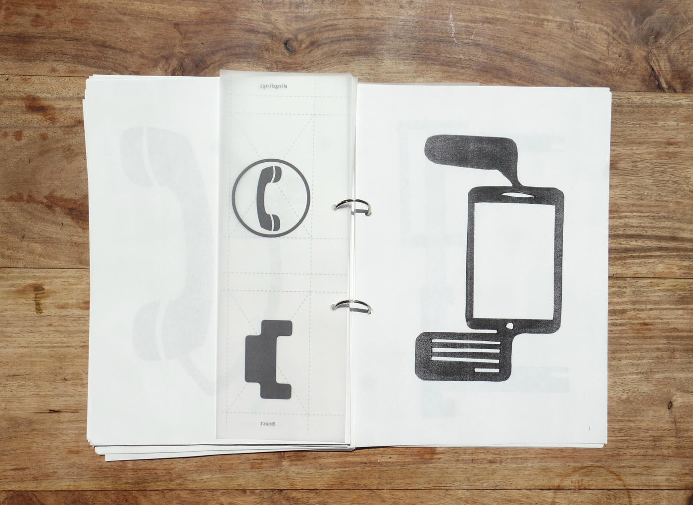
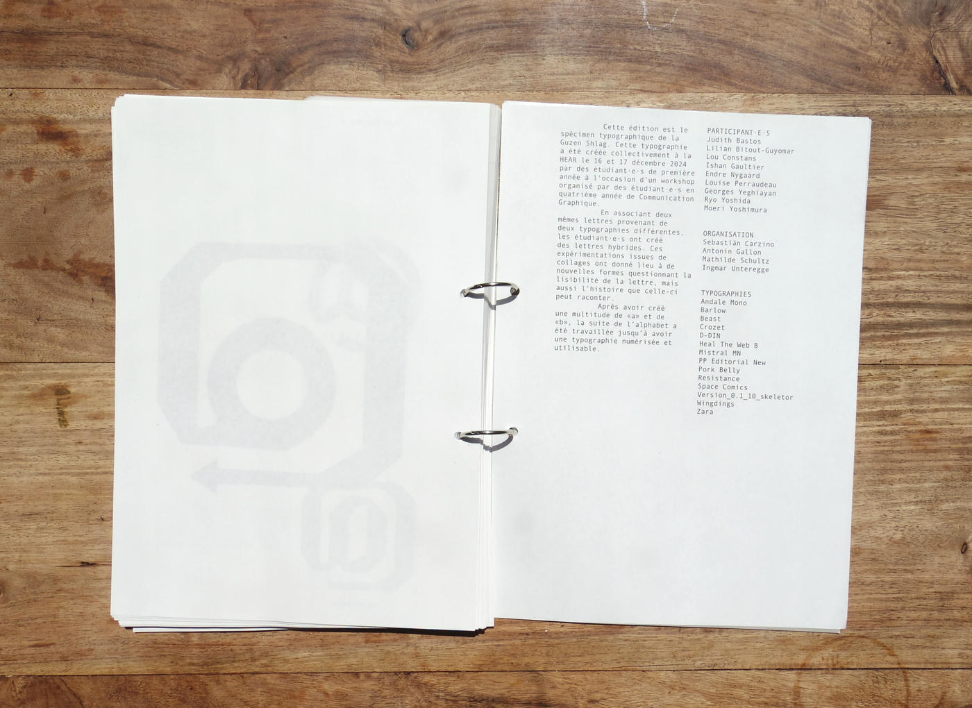
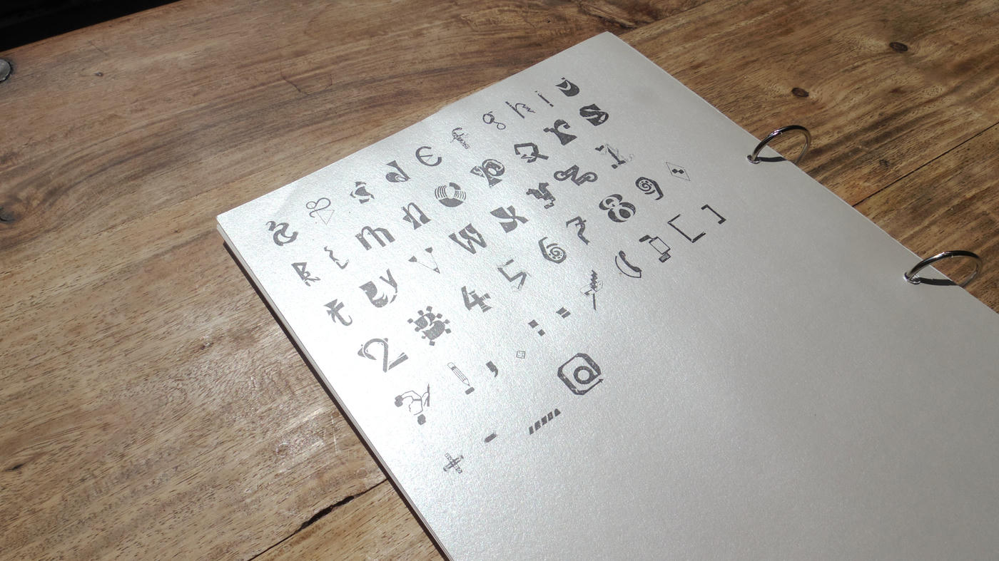
Together with three other fourth-year graphic design students at HEAR (Haute école des arts du Rhin), we organized a workshop for first-year students at the school, during which we created the free font Guzenshlag.
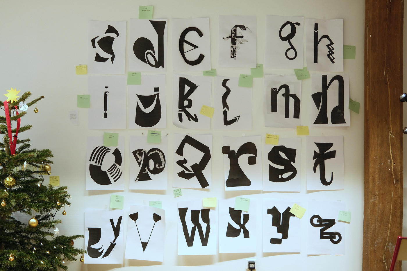
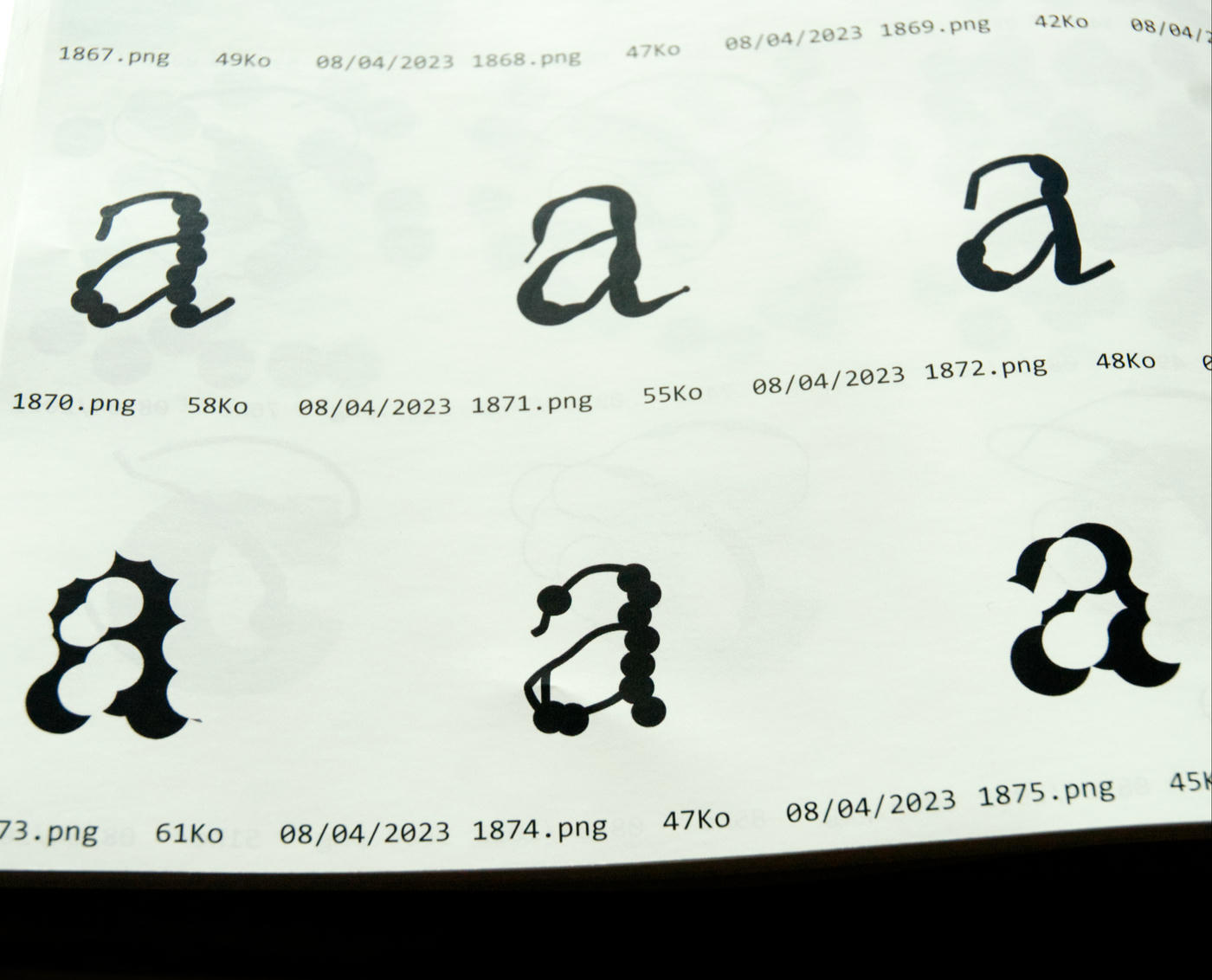
By combining two identical letters from two different typefaces, the students created hybrid letters. These experiments, based on collages, raised questions about letters, their shapes, their legibility, and their history.
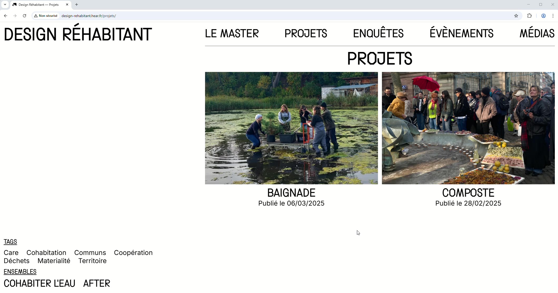
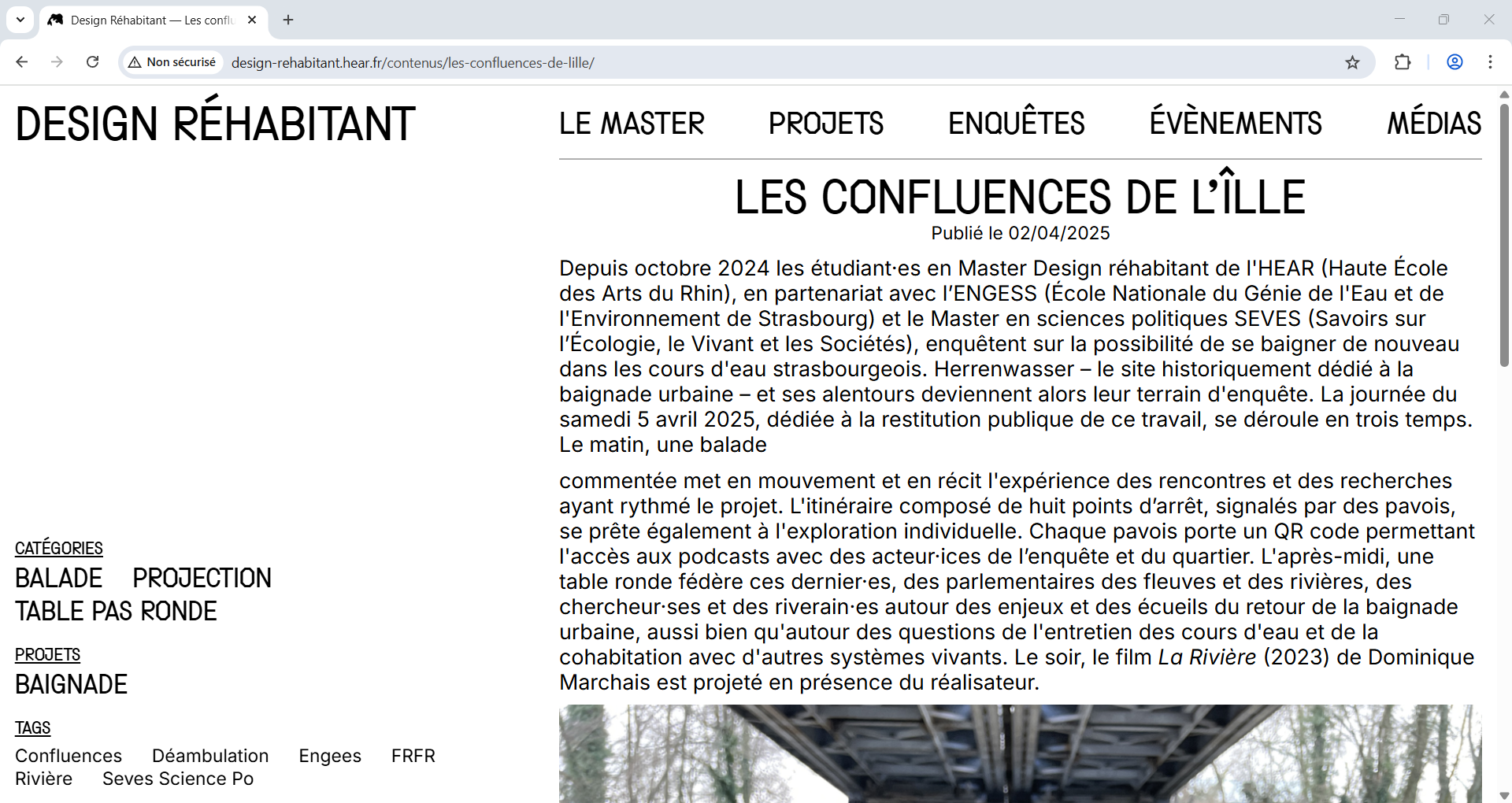
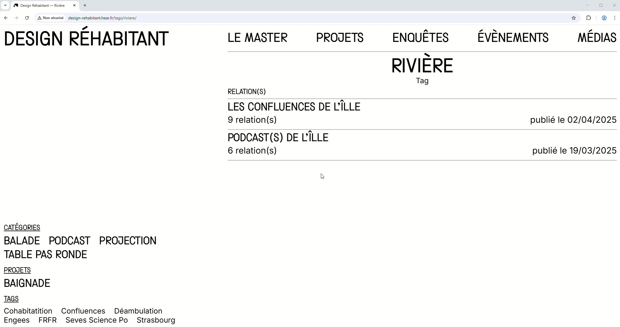
Design réhabitant is a master's program that questions the role of design in a finite world, in line with bioregionalist thinking.
I designed their website in collaboration with the students and teachers of the department, with the aim of creating a space for communication and a tool for documentation and research integrated into the program.
The horizontal organization of the site highlights the relationships between the various human and non-human actors involved in the students' research and projects.
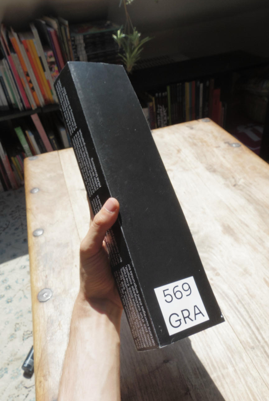
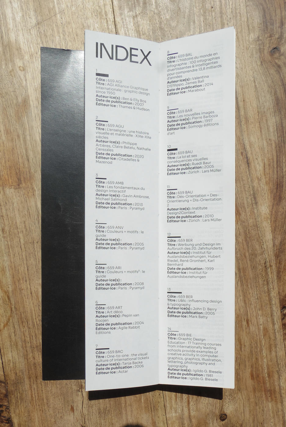
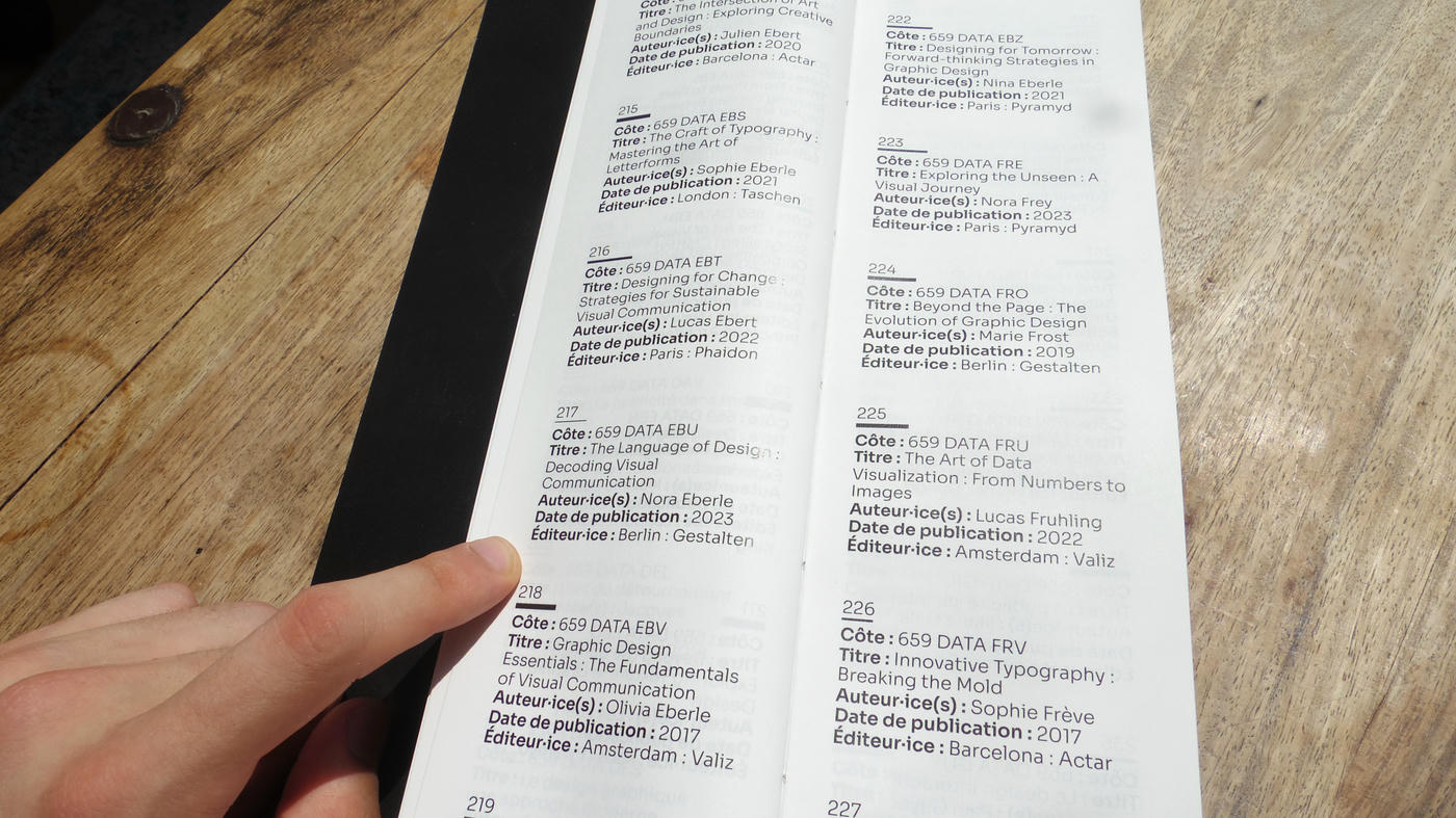
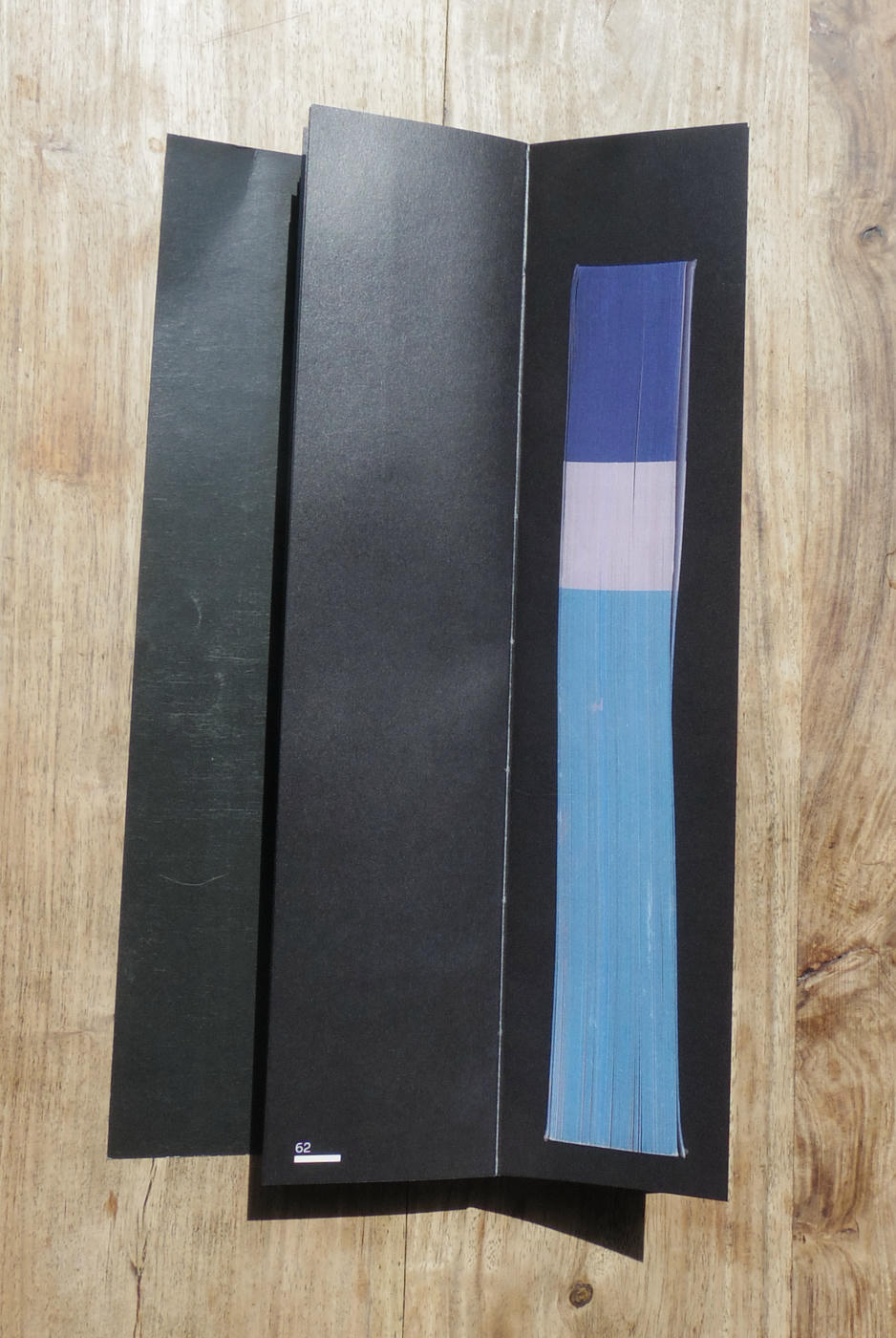
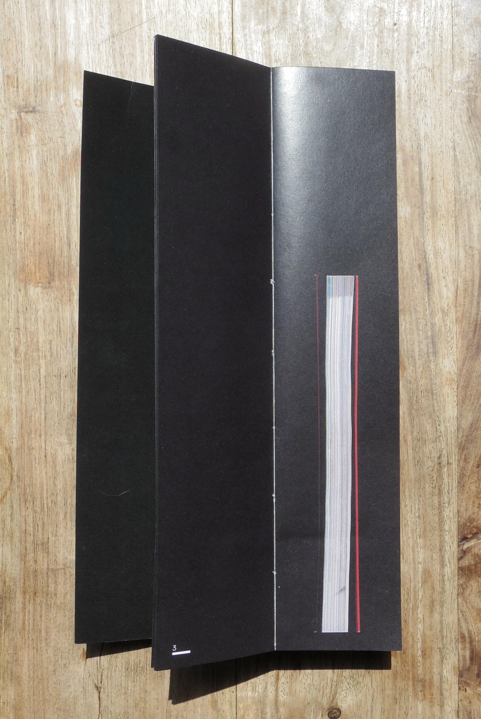
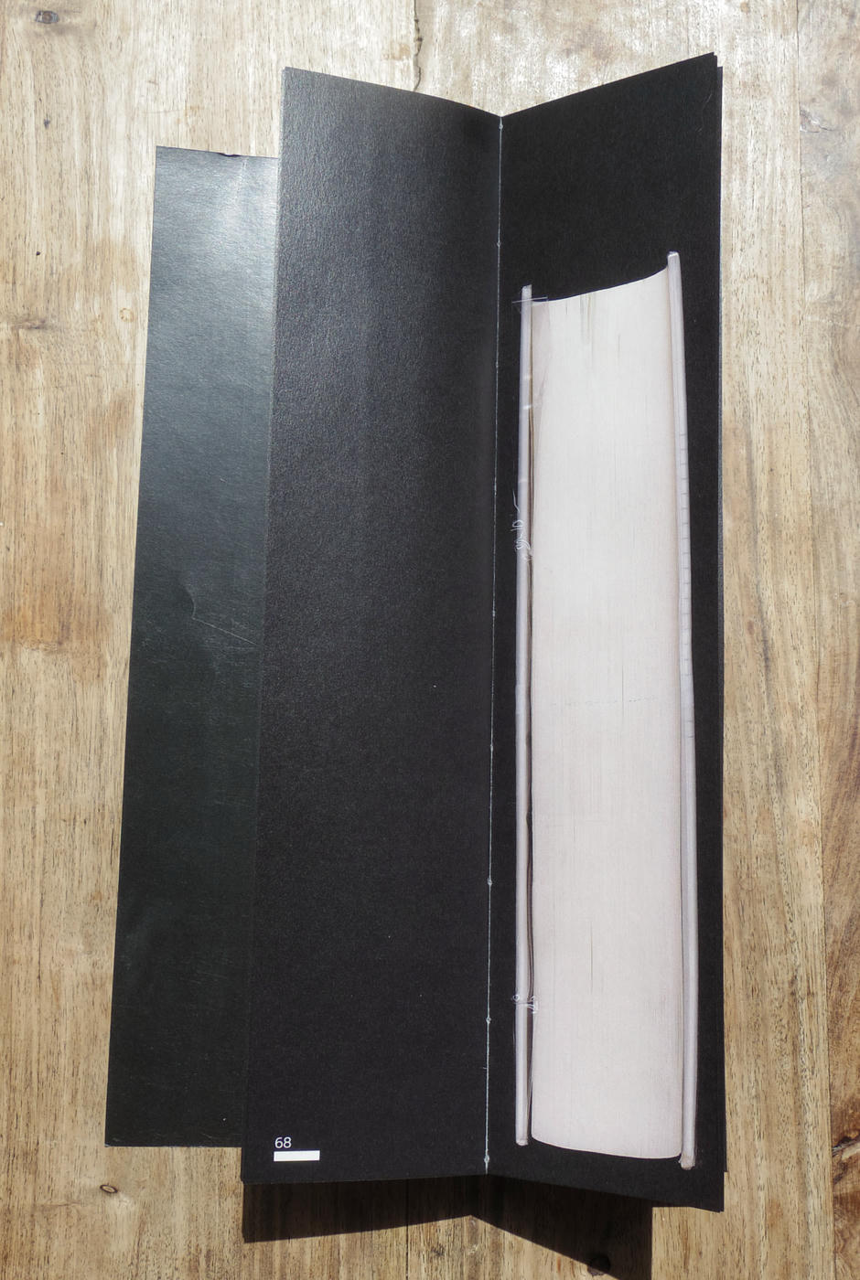
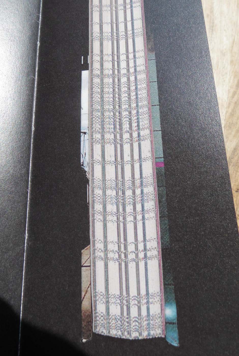
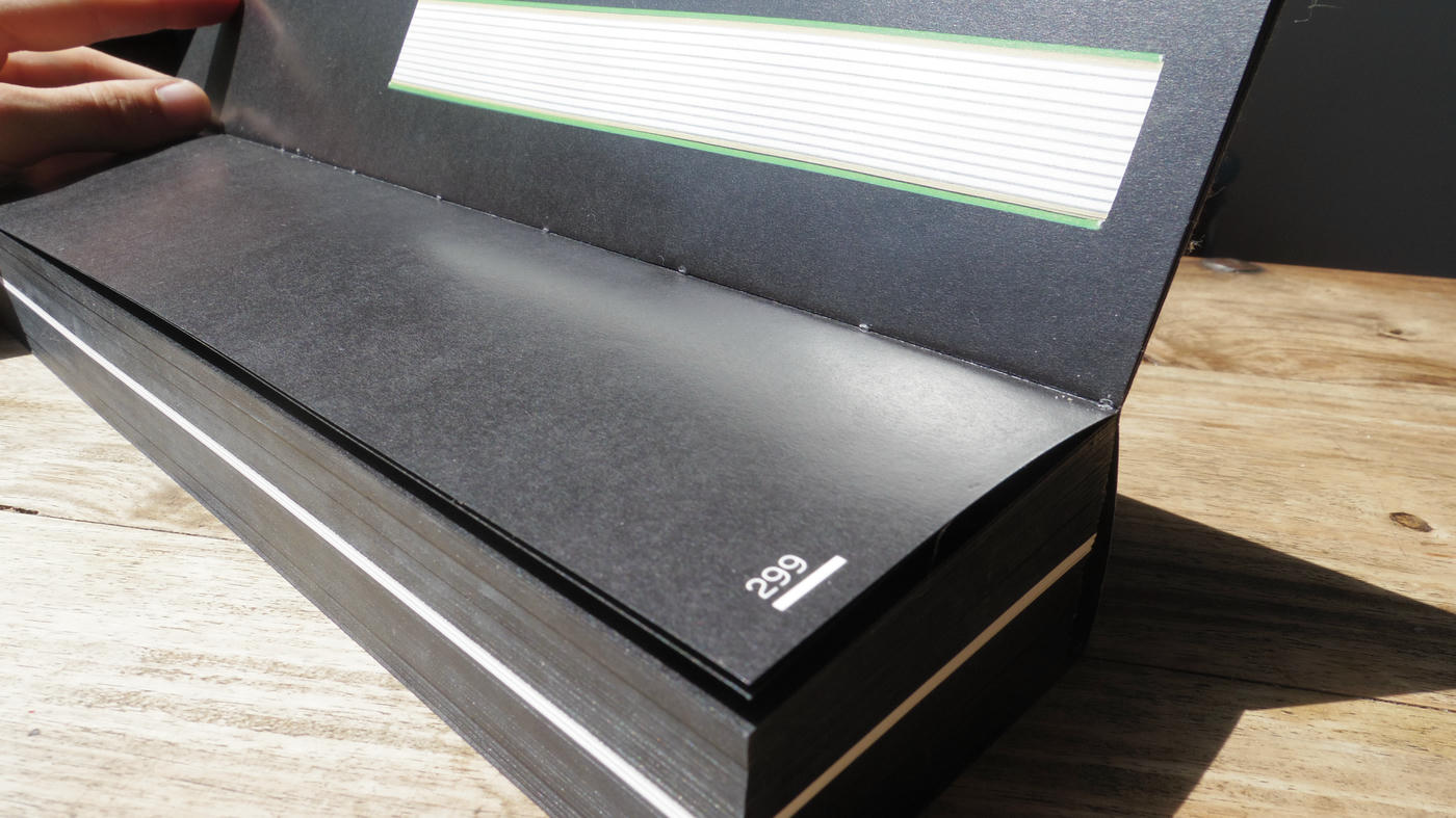
569 GRA is the classification code for graphic design books at the HEAR (Haute école des arts du Rhin) media library. This project brings together the 299 books that bear this classification code. The aim is to focus on a detail of the book as an object that is often overlooked, yet can be meaningful.
The slices are shown to scale and give the unexpected format of the book, with the width and height of the pages corresponding to the widest and tallest slice.
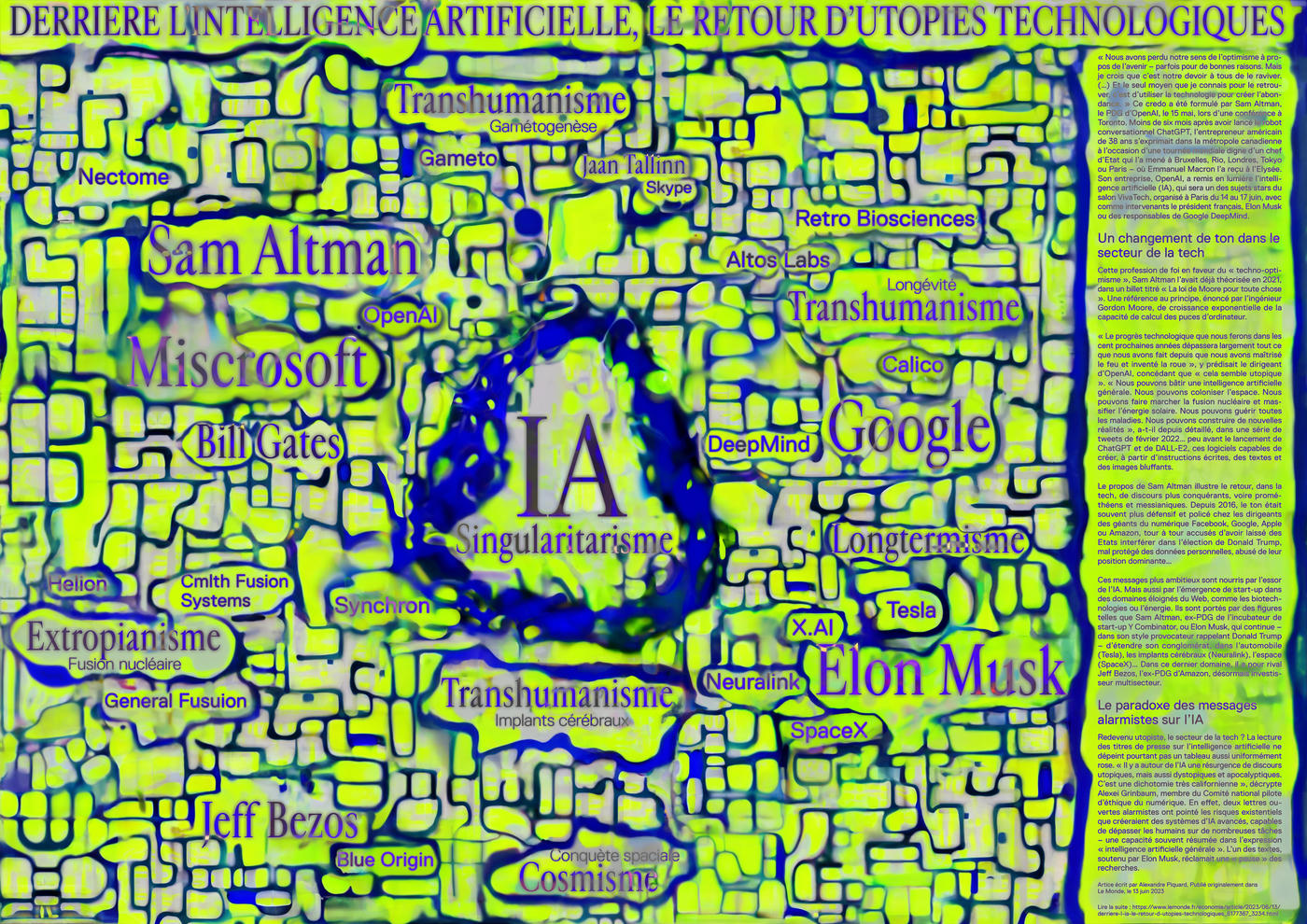
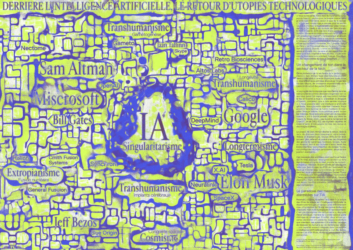
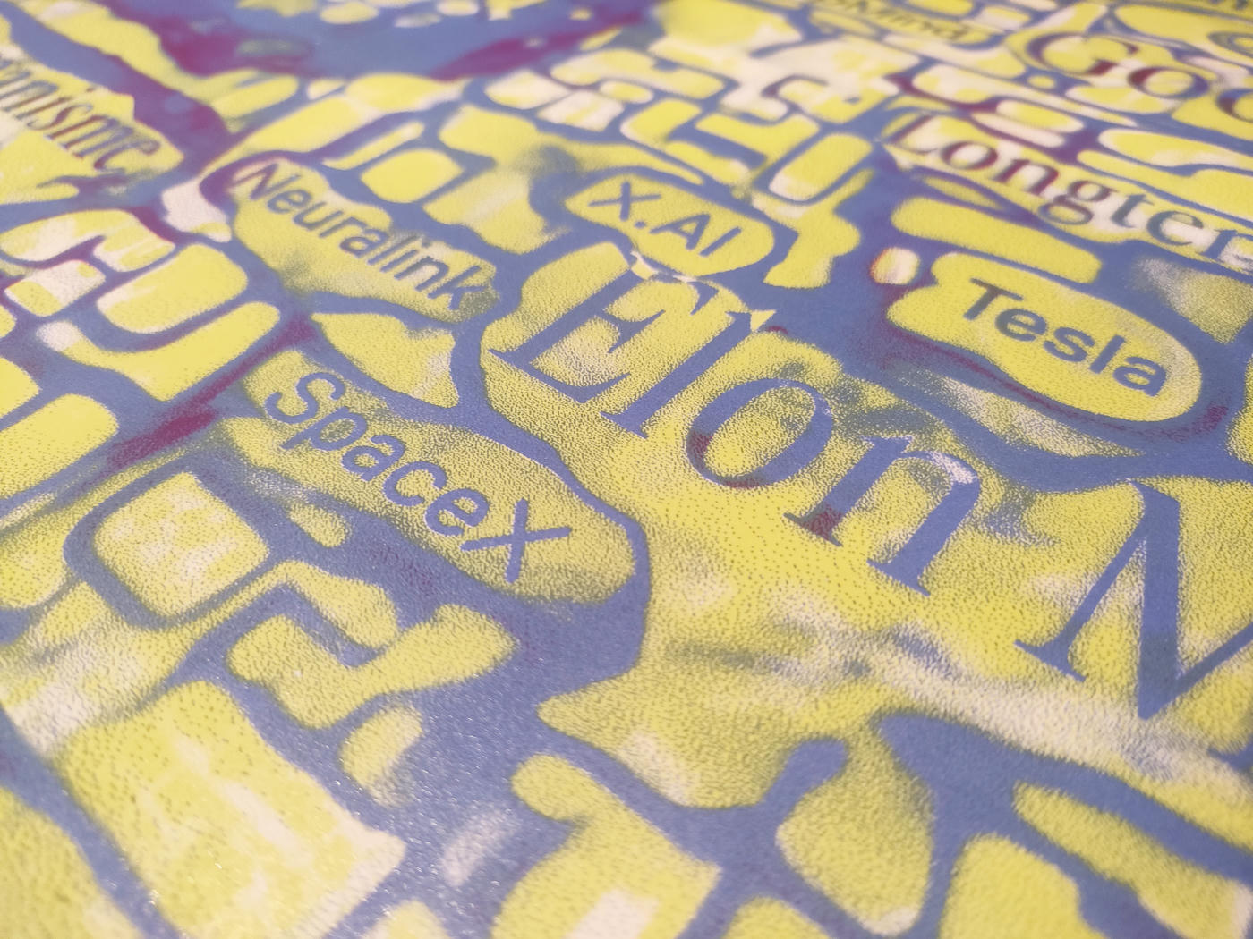
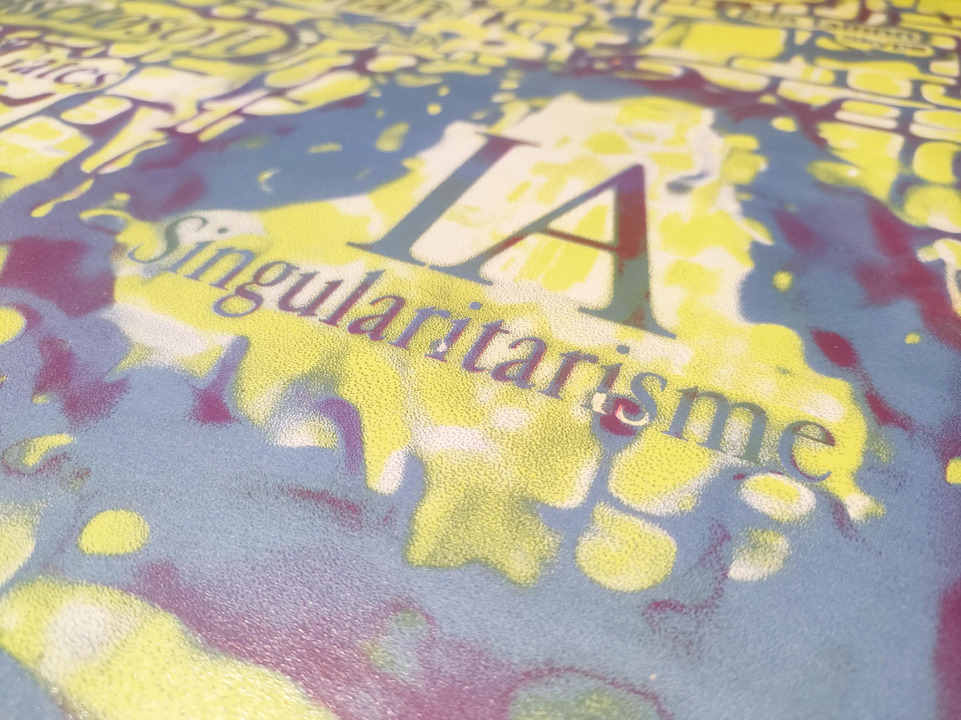
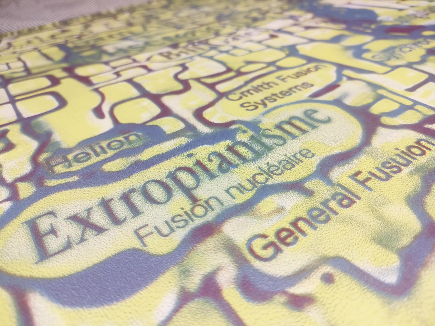
Inspired by Alexandre Piquard's article “ Derrière l’intelligence artificielle, le retour d’utopies technologiques ” (Behind artificial intelligence, the return of technological utopias) published in Le Monde newspaper, this poster attempts to graphically represent the tescrealist ideology, a mixture of transhumanism, extropianism, singularitarianism, cosmism, rationalism, effective altruism, and long-termism.
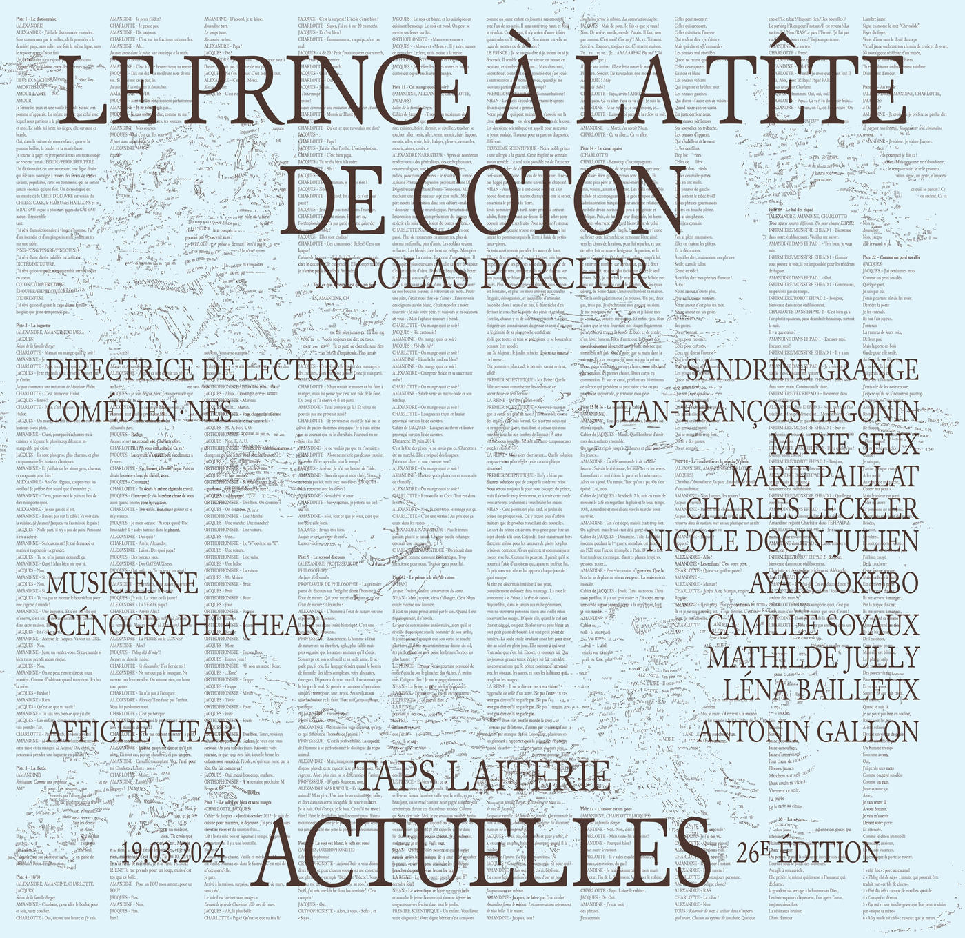
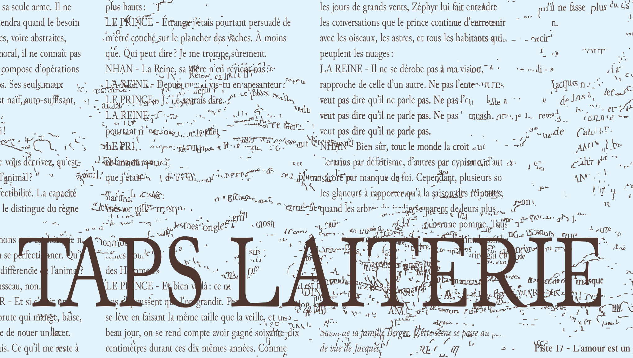
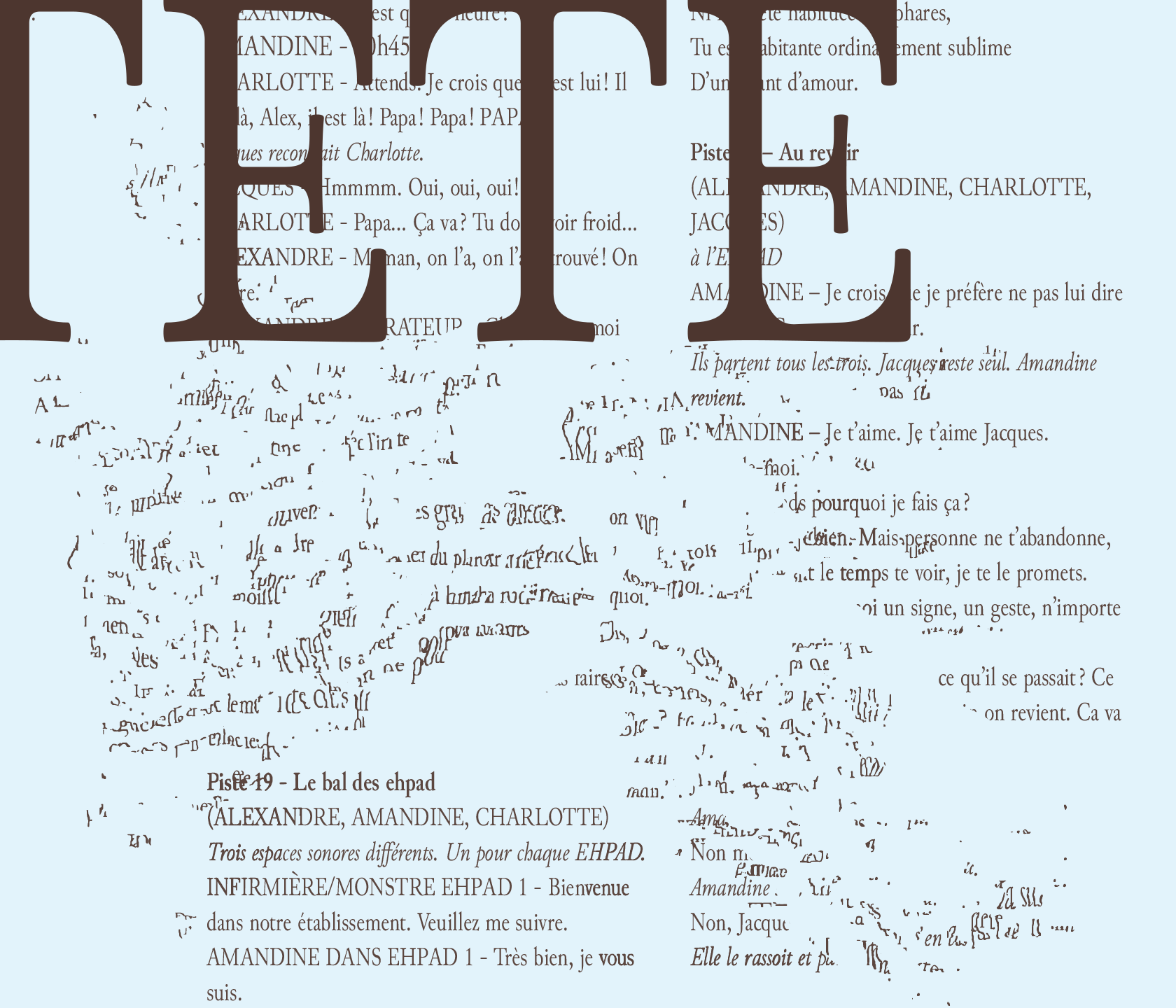
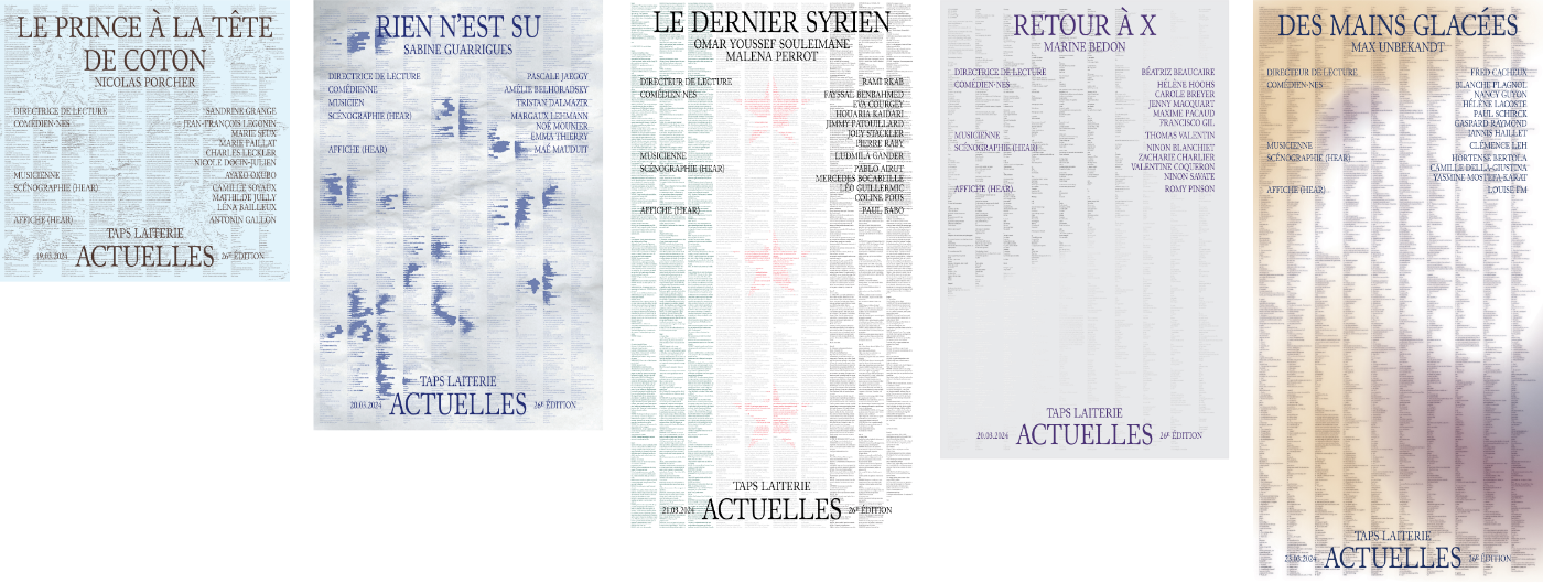
The poster for Le prince à la tête de coton (The Prince with a cotton head) is part of a series of posters created to accompany the 27th edition of the Les Actuelles theatrical reading festival organized by TAPS (Théâtre actuel et public de Strasbourg). This series is the result of a collaborative effort between five students from HEAR (Haute école des arts du Rhin). A set of rules was defined collectively, such as the idea that the length of each poster would be determined by the length of the text. The graphic designers then each created a poster.
In this poster, the text of Le prince à la tête de coton (The Prince with a cotton head) written by Nicolas Porcher Jouve is riddled with typographical errors and distortions that make the words lose their meaning. This illustrates the neurodegenerative disease affecting one of the characters in the play.
In collaboration with: Romy Pinson, Maé Mauduit, Louise Faure, Paul Babo
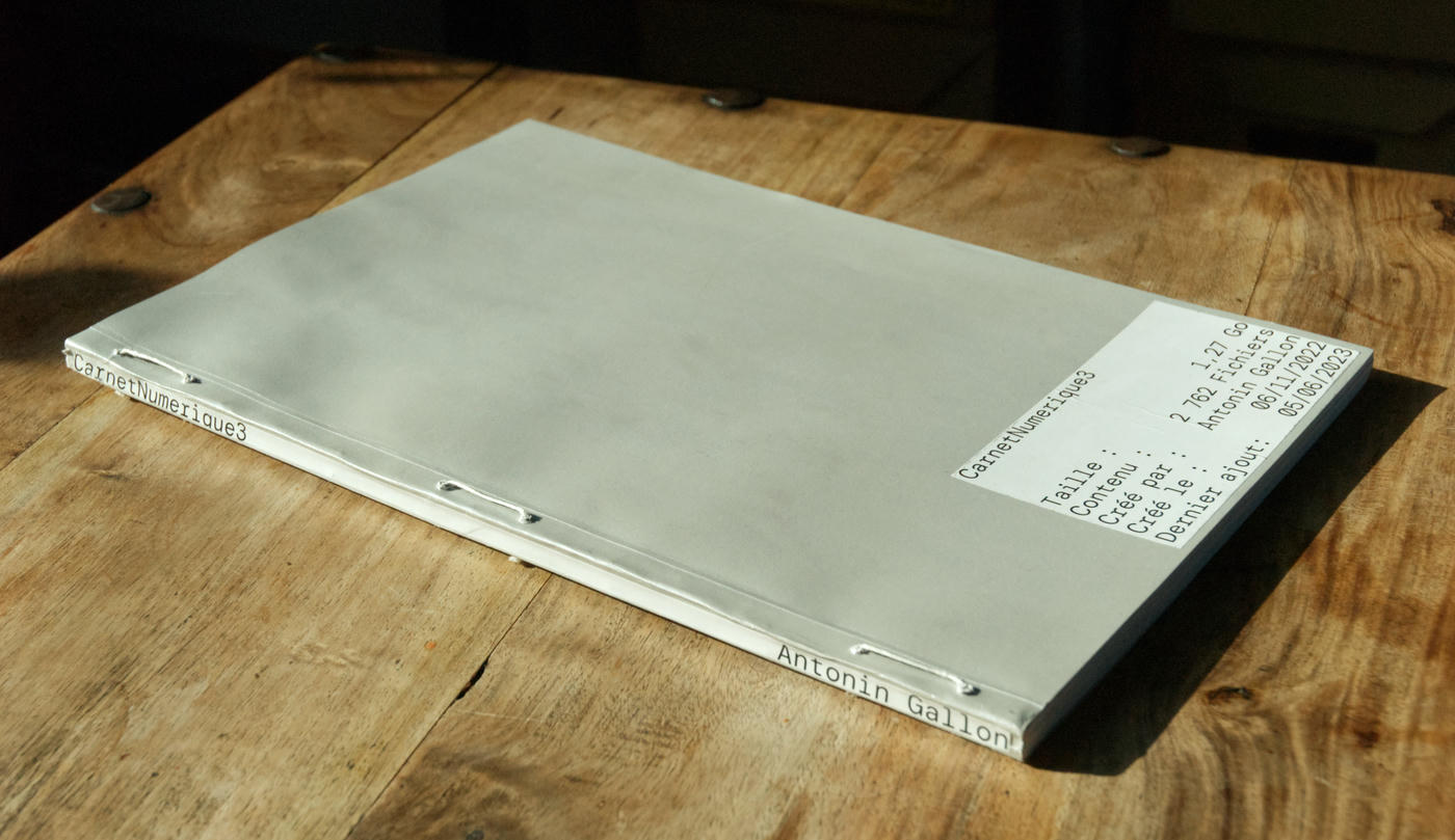
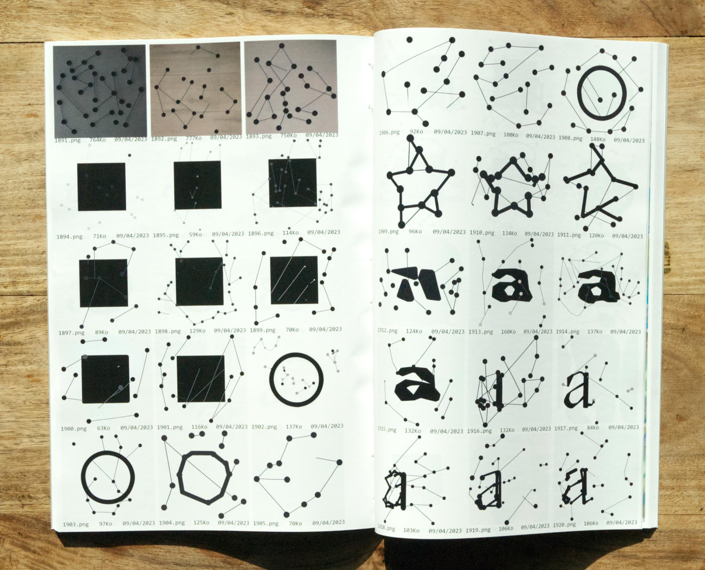
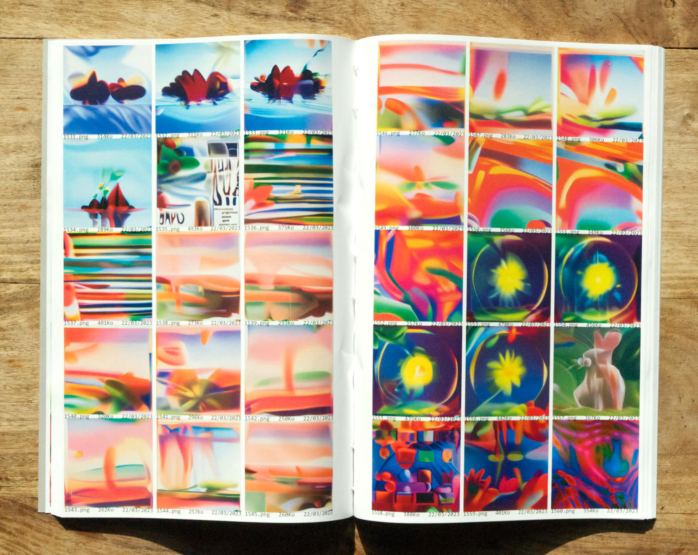
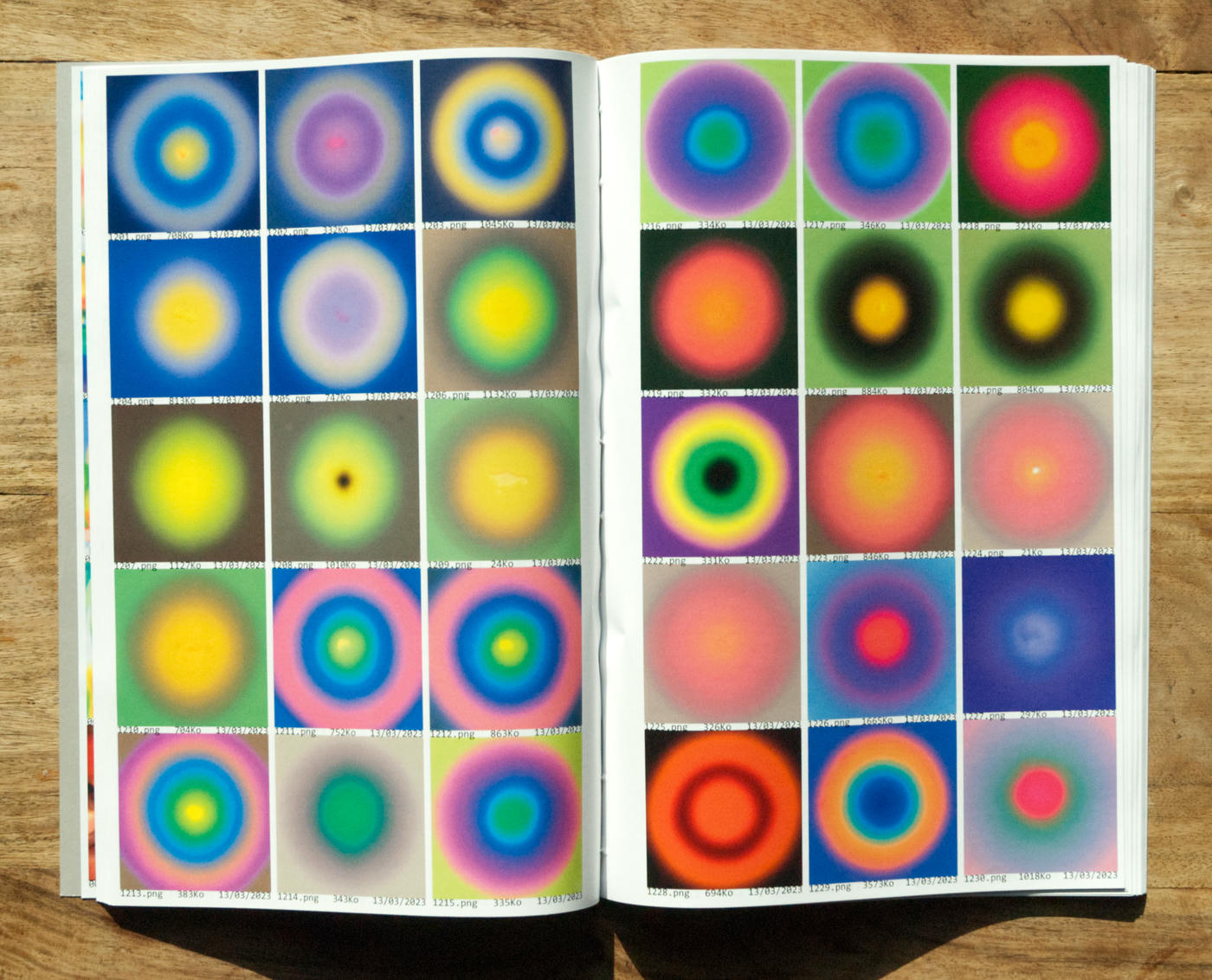
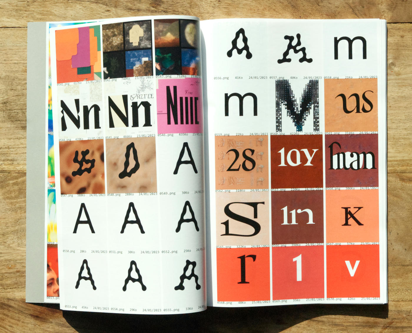
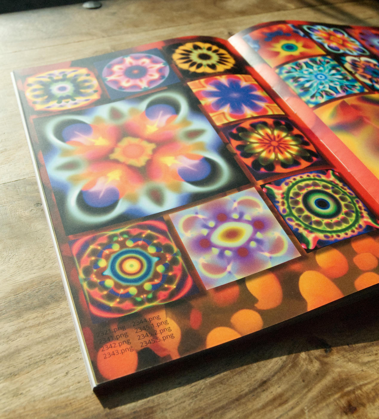
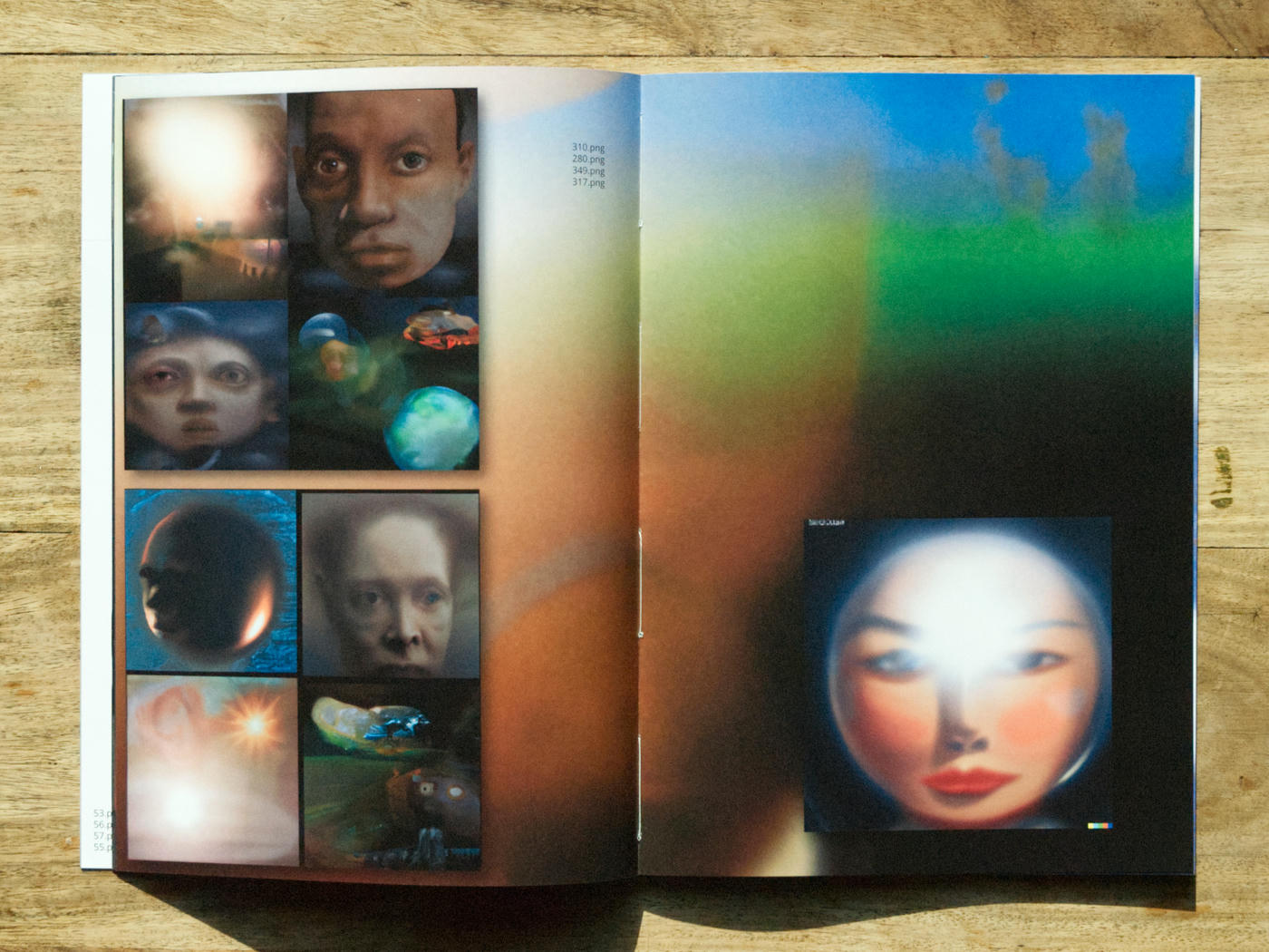
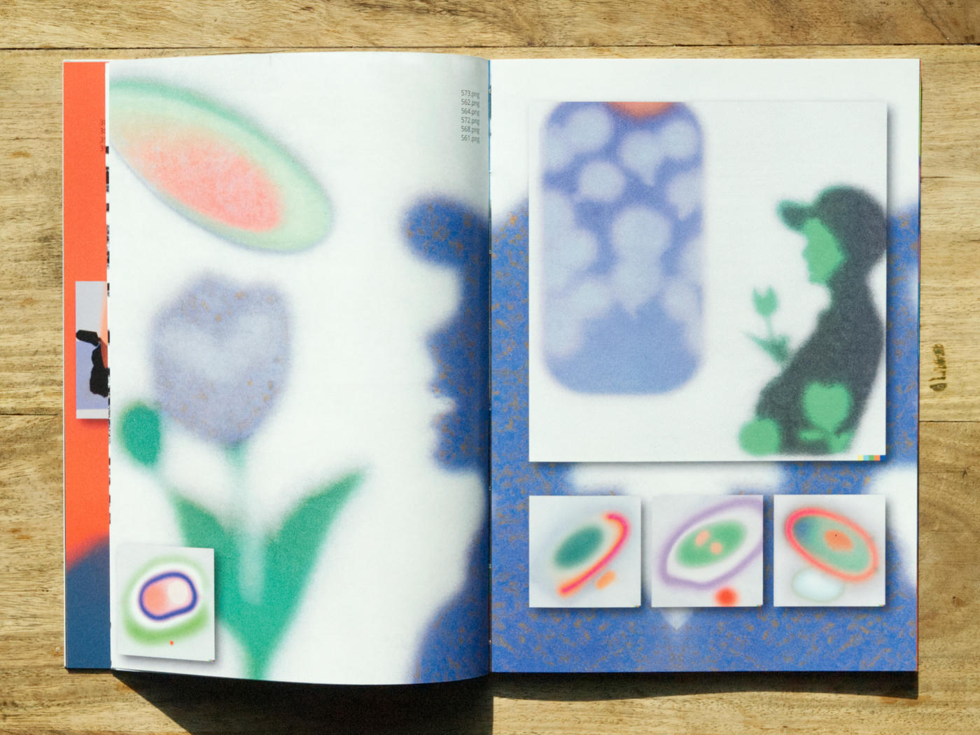
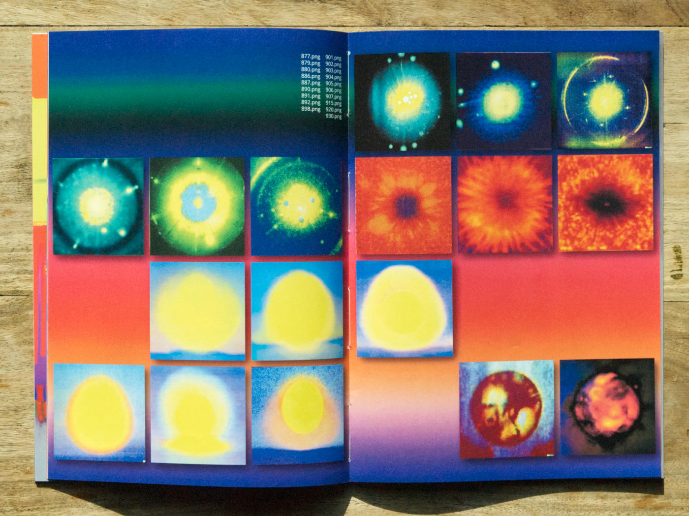
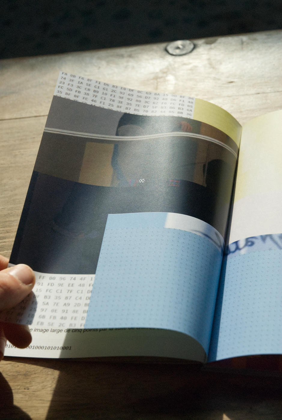
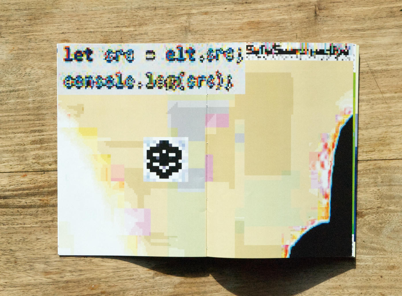
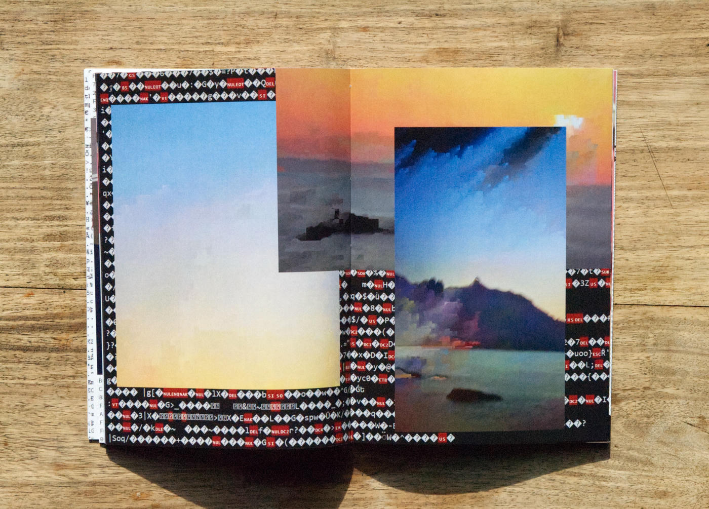
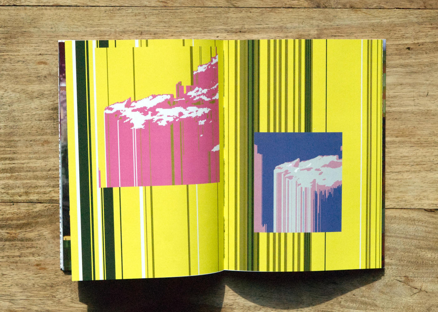
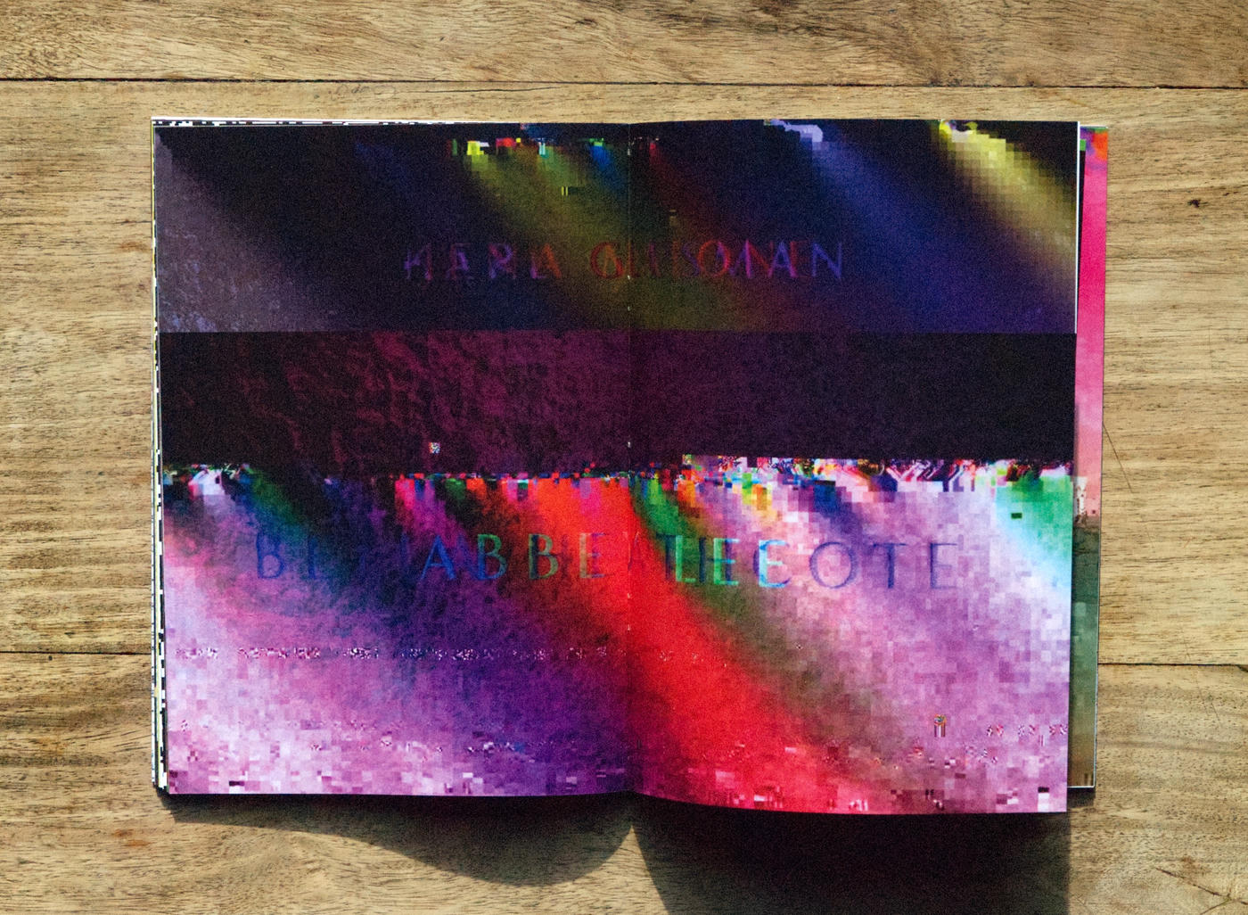
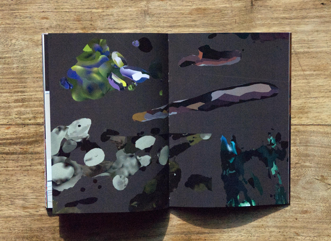
Over the period 2021-2023, I produced a lot of visual experiments, abandoned projects, explorations of tools, and graphic games. As my practice is mainly digital, these images often remained forgotten at the depths of a hard drive.
So, at the end of each semester, I obliged myself to quickly produce an edition to archive and showcase this research.
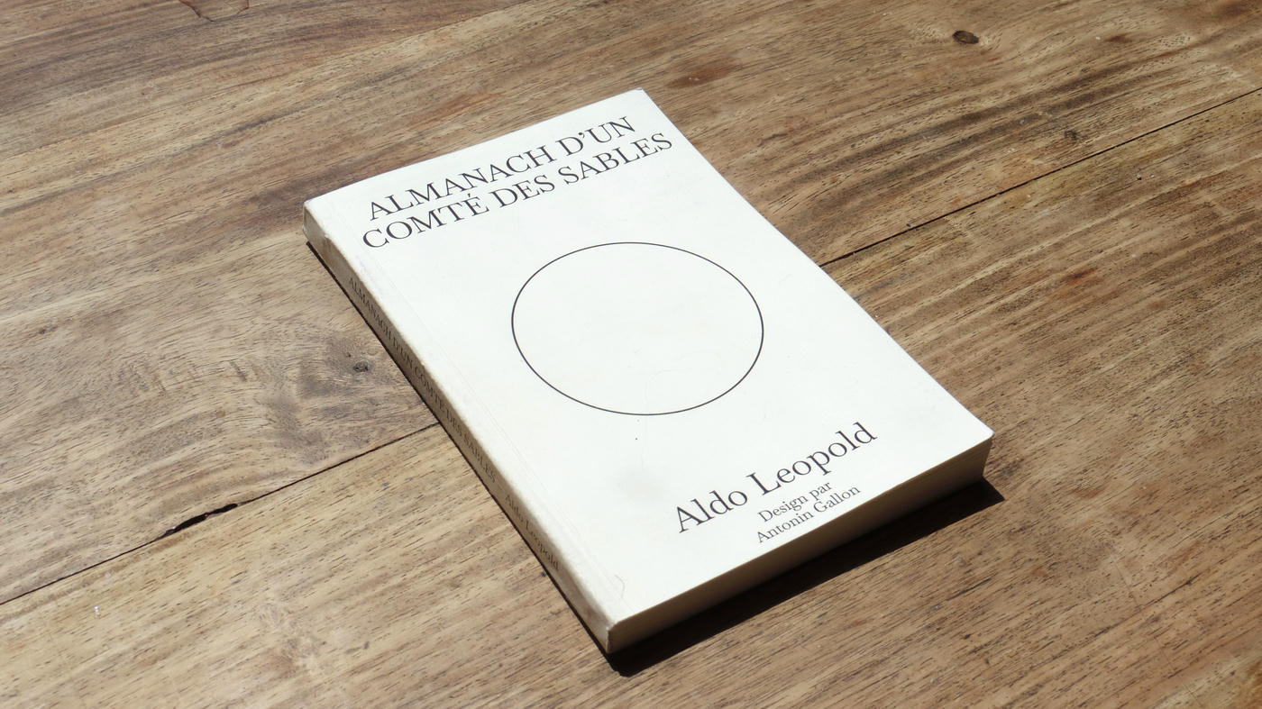
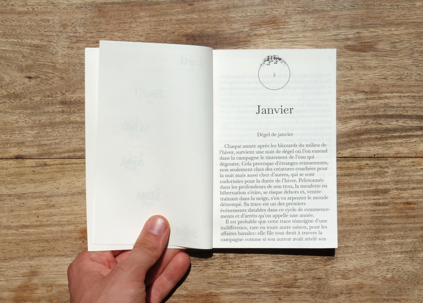
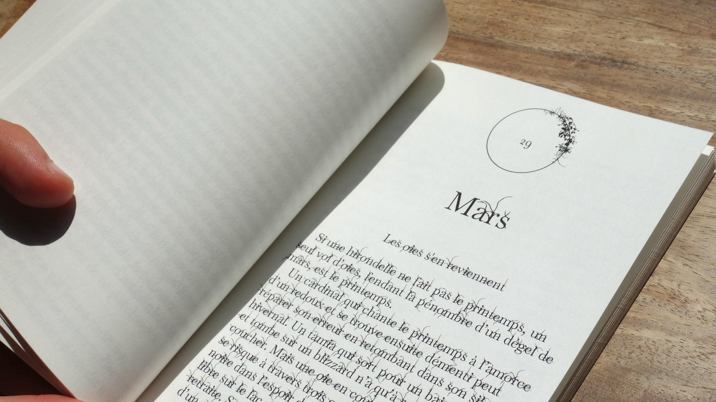
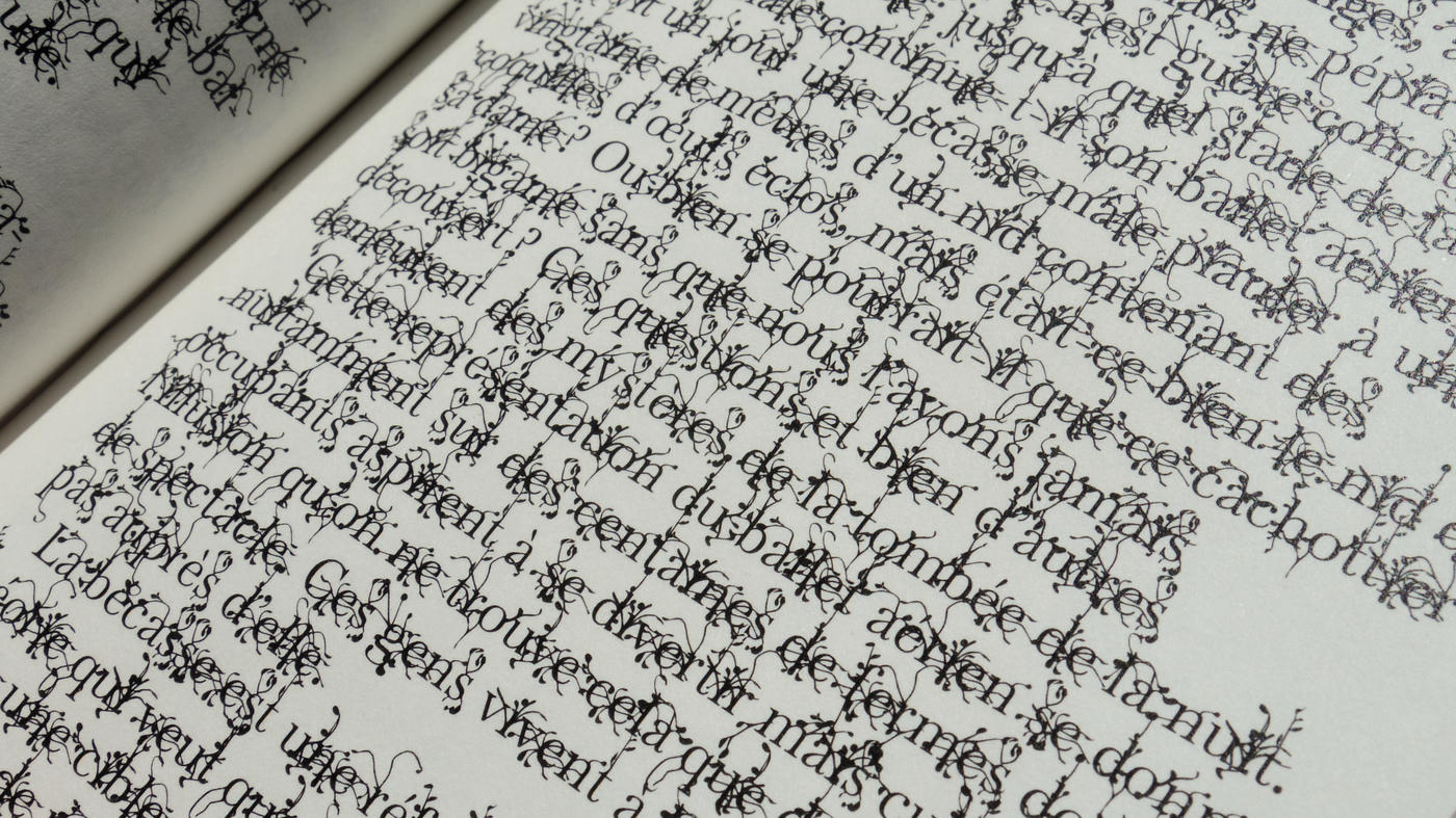
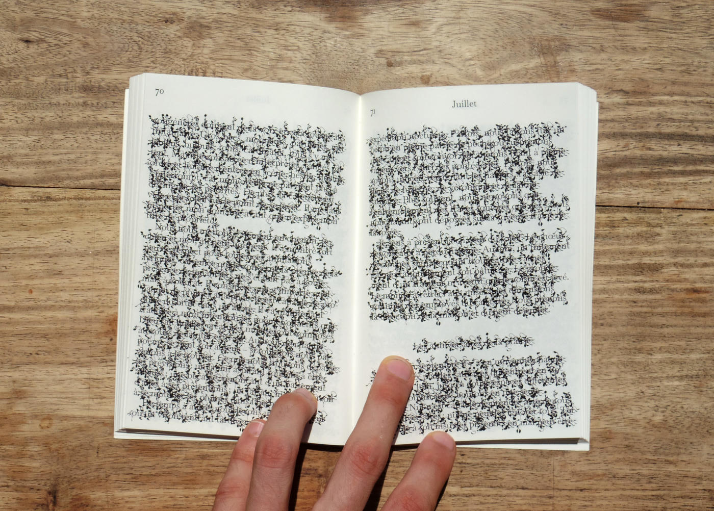
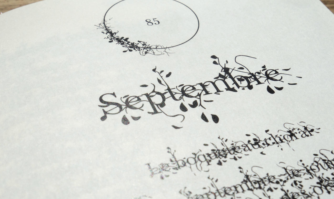
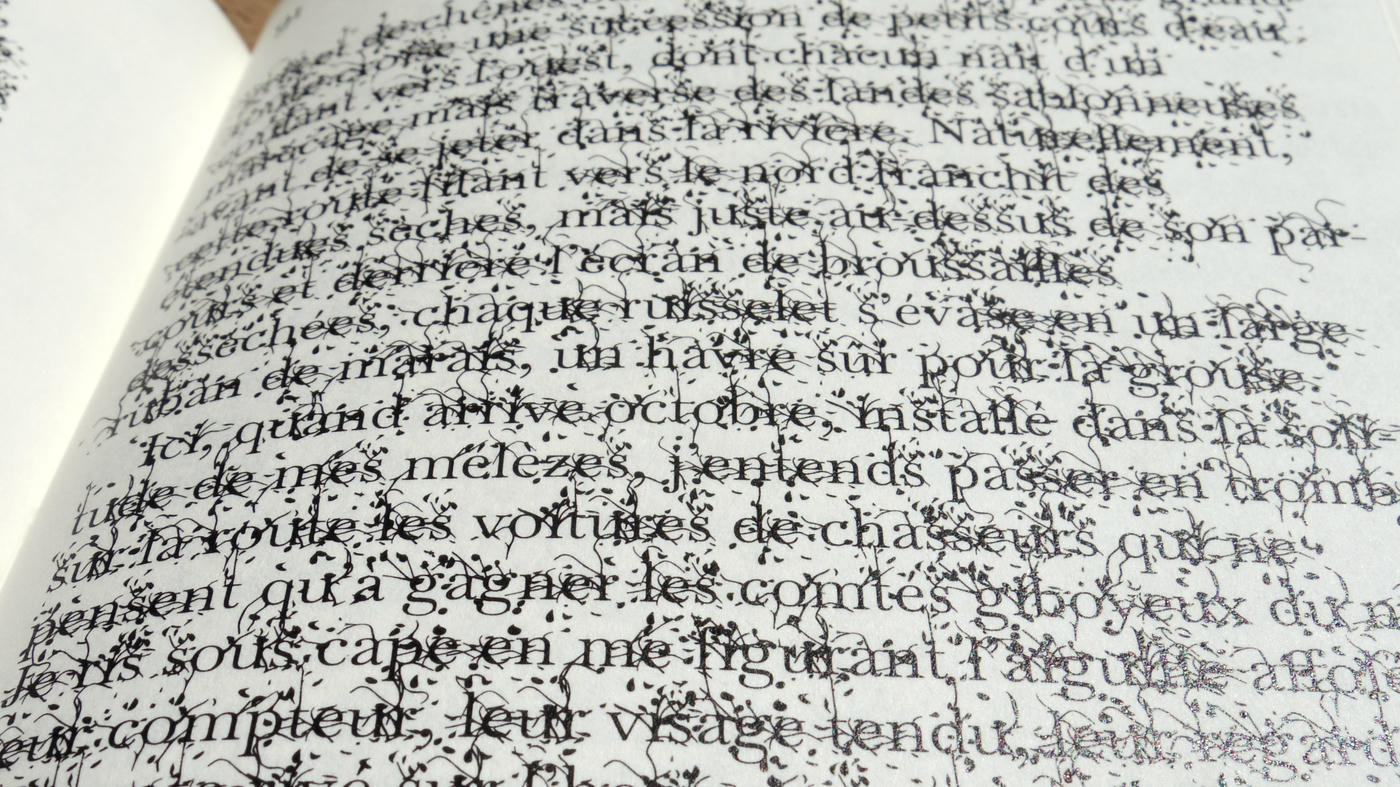
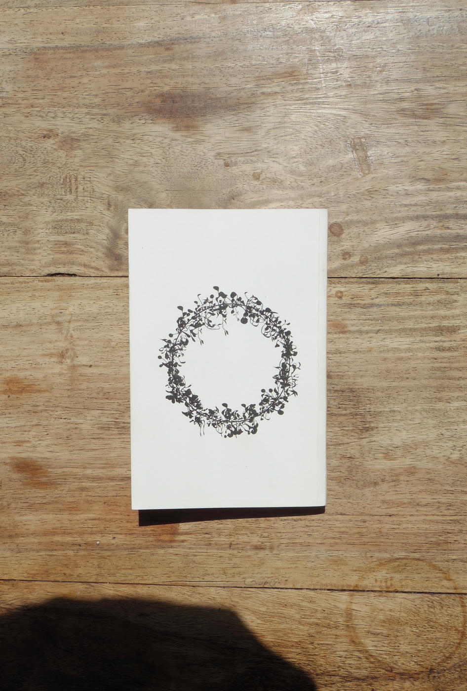
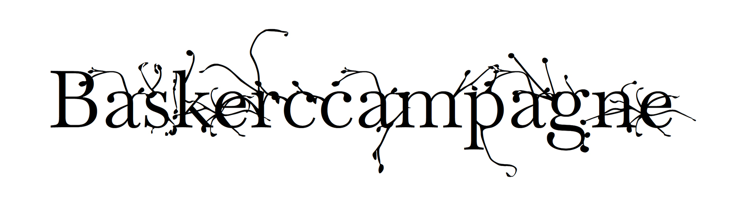
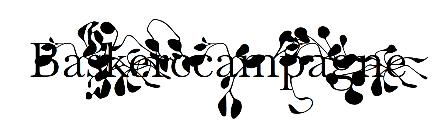
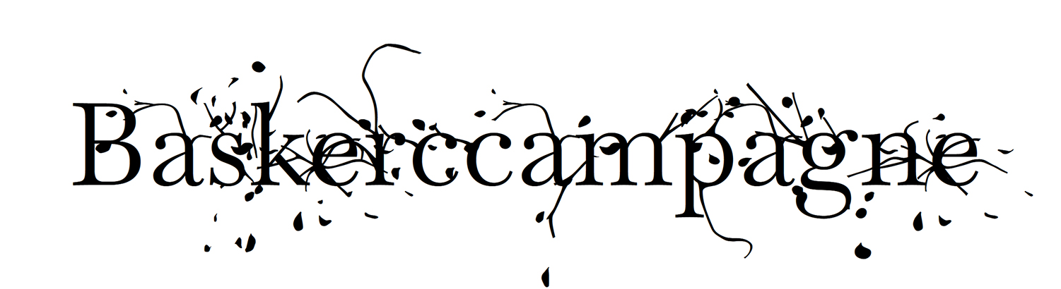
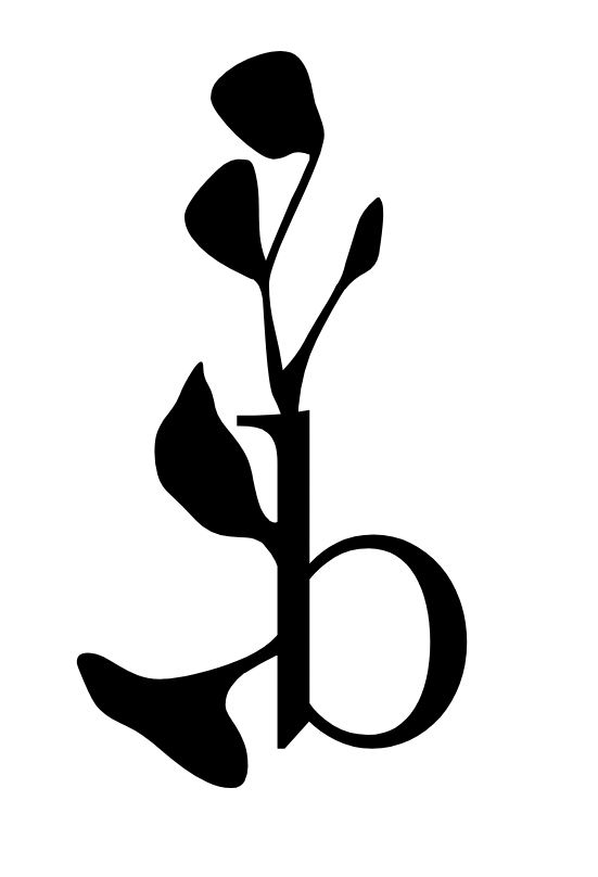
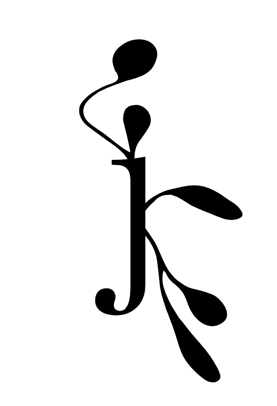
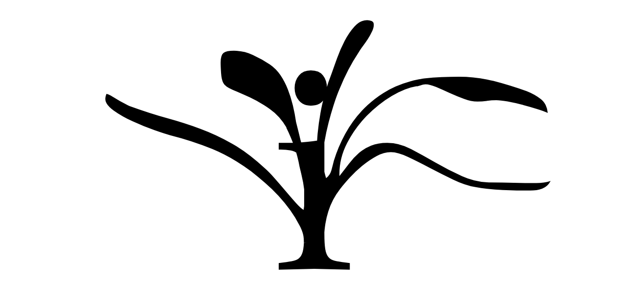
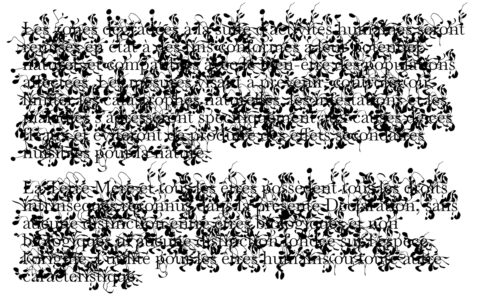
A Sand County Almanac, And Sketches Here and There is a book published in 1949 and written by American ecologist Aldo Leopold. In it, the author describes his observations of nature around his farm in Wisconsin over the course of a year.
This proposal is a graphic reinterpretation in which the letters of the text grow like plants with the passing of the seasons. It is an experiment in the meaning conveyed by typography beyond words.
The typography specially designed for this work will soon be available under a free license here.
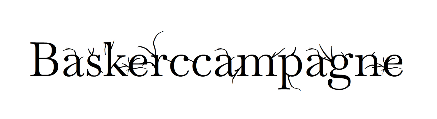
Baskerccampagne is an adaptation of Baskervville designed by Rosalie Wagner at the ANRT (Atelier national de recherche typographique). It is a variable typeface originally designed for the graphic reinterpretation project of the A Sand County Almanac, And Sketches Here and There. It evolves with the seasons, starting from the original letter, growing to have large leaves in summer, and losing them when winter arrives.
Test the typeface here
Soon available under a free license
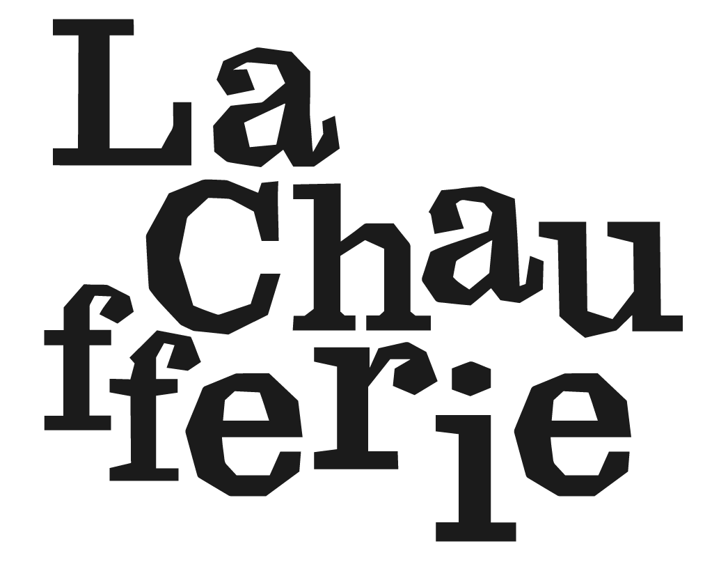
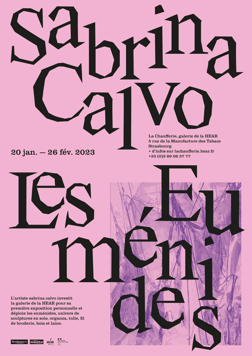
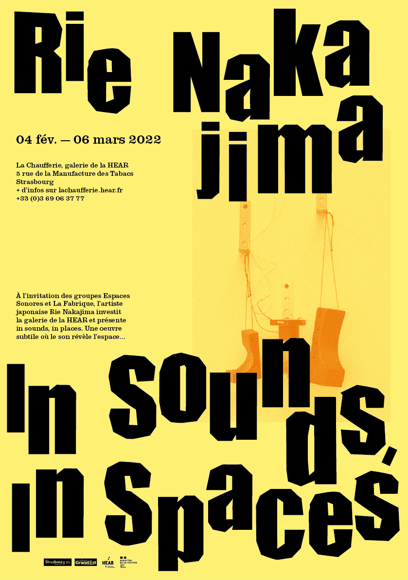
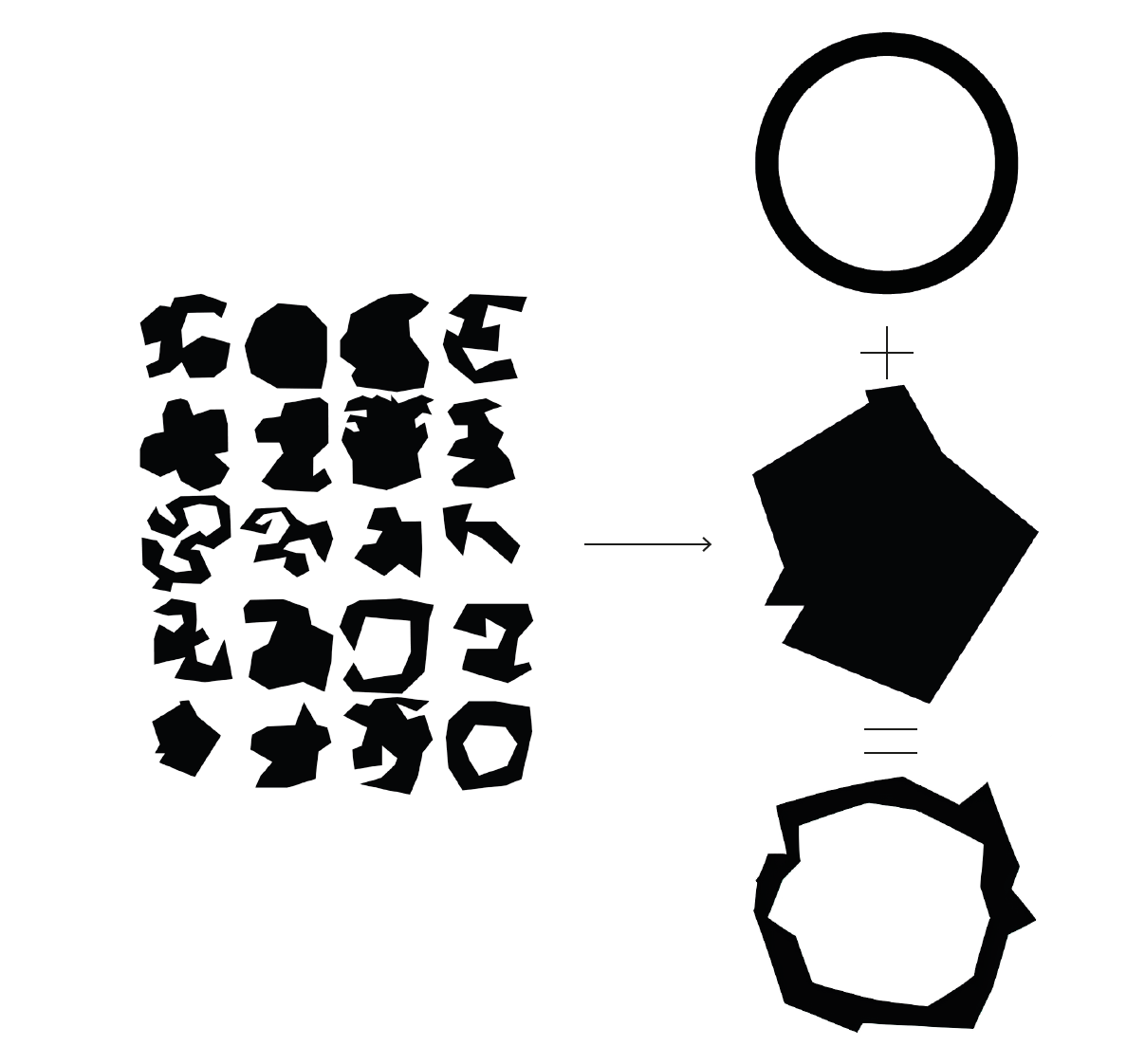
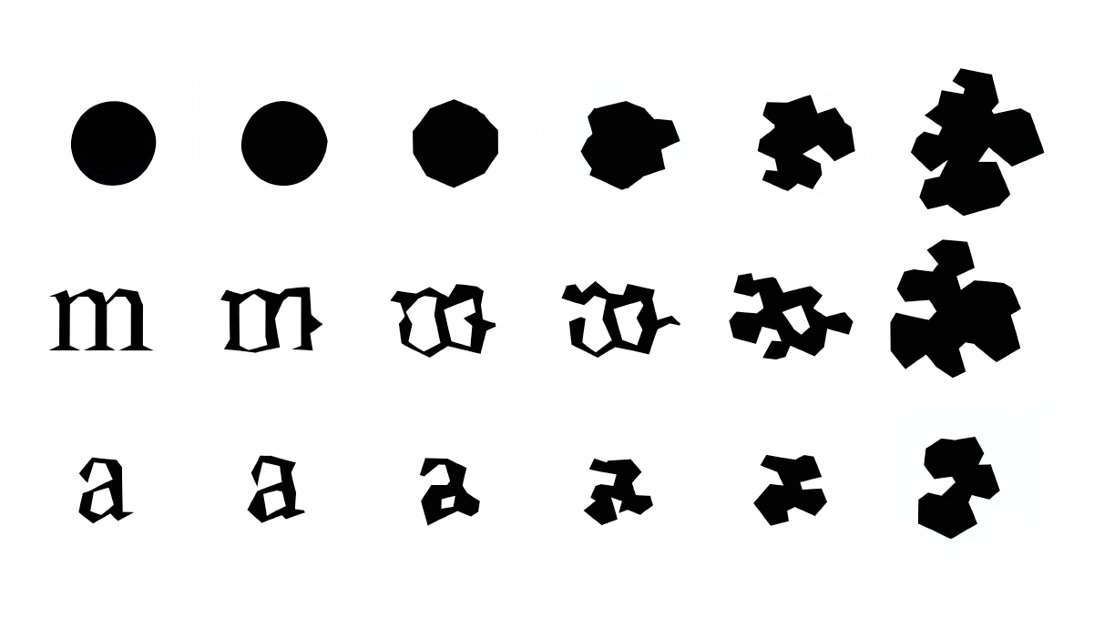
This work, designed for La Chaufferie, an exhibition space at HEAR (Haute école des arts du Rhin) in Strasbourg, questions the place of shapes and typography in visual identity.
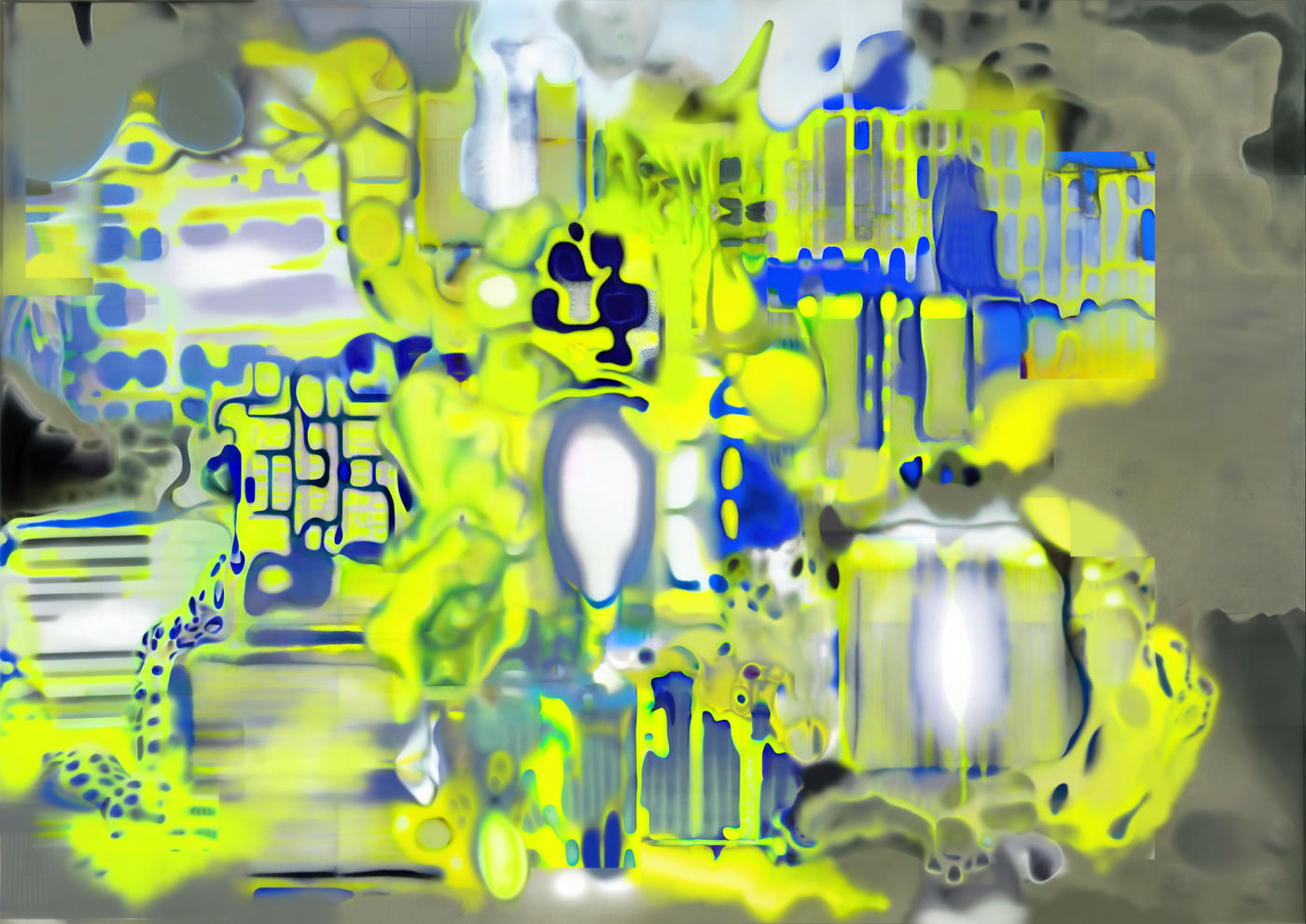
Instead of using the same font throughout the season's posters, as is often the case with visual identities, the typographies change and are passed through a machine learning program trained to apply a formal language to graphic input data.
In collaboration with Xavier Amigues
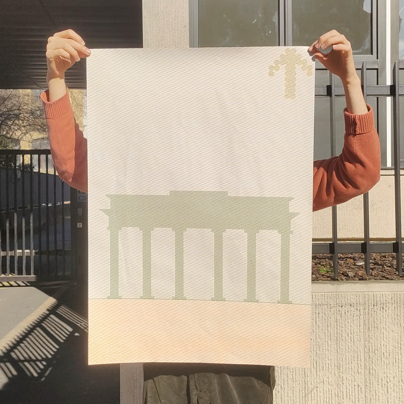
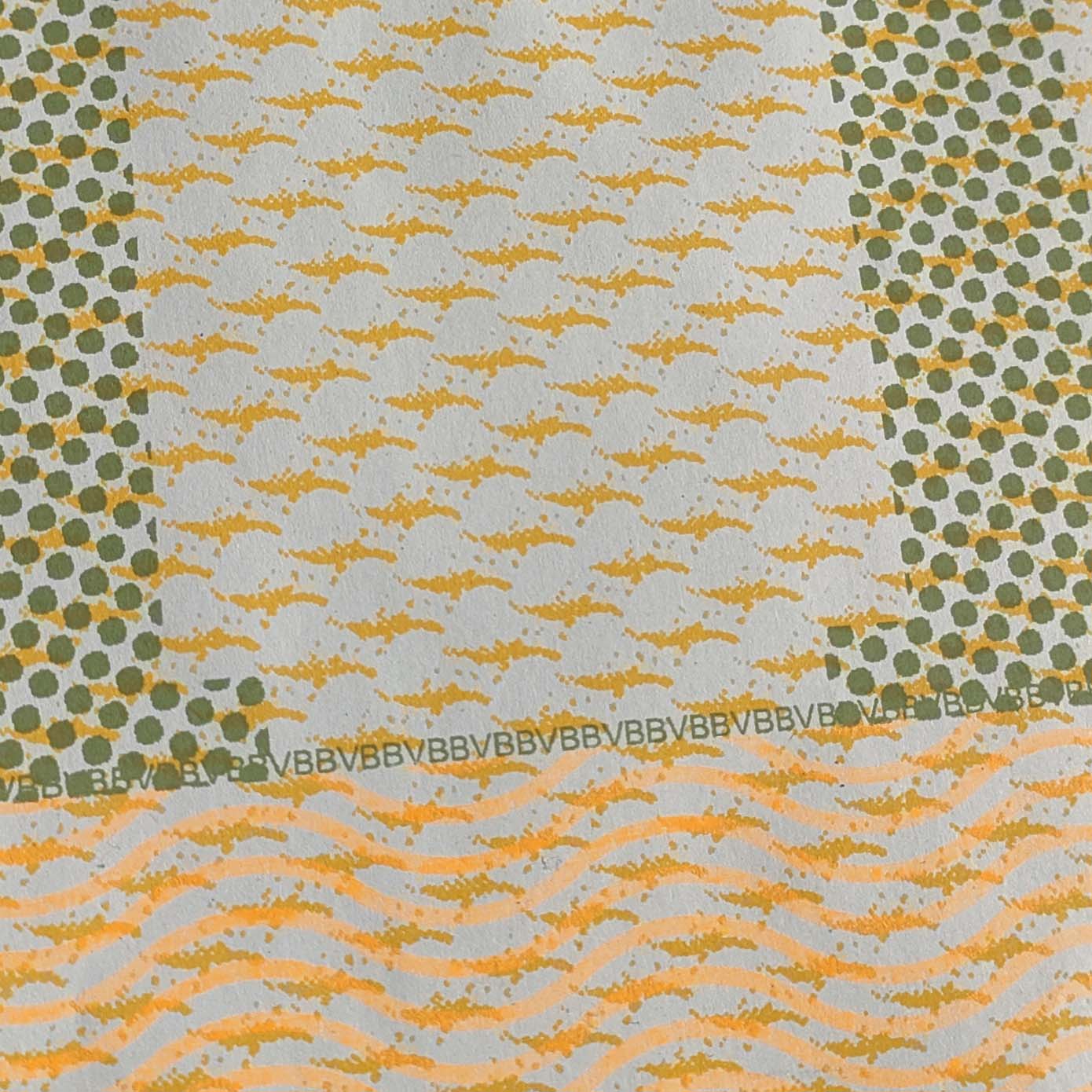
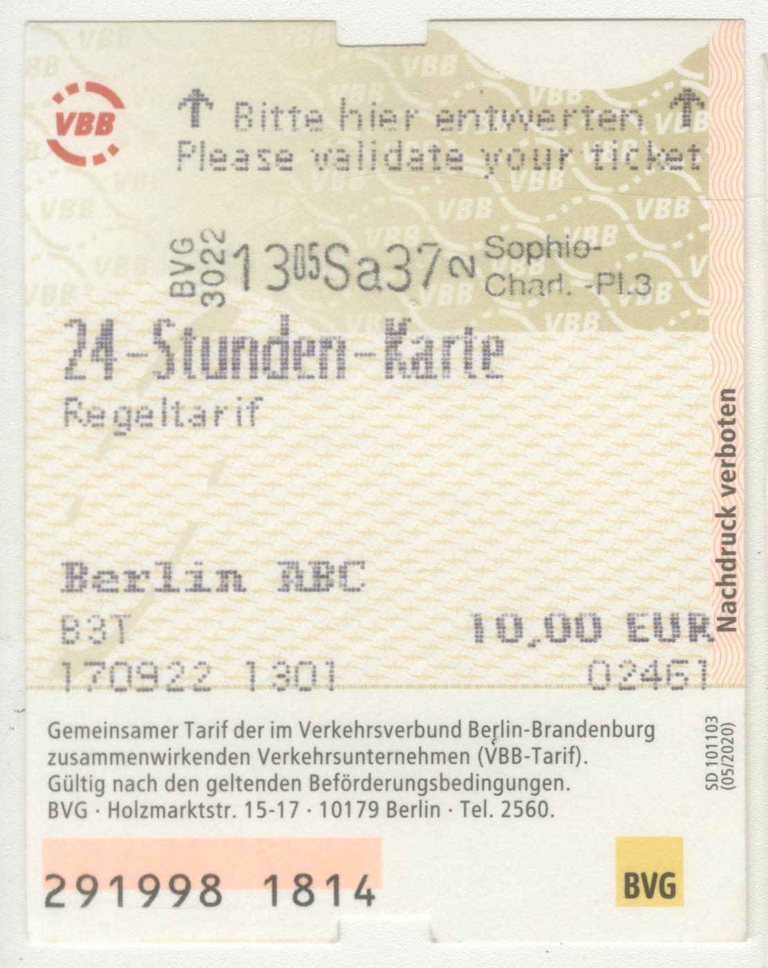
This silkscreen print, depicting the Brandenburg Gate, repurposes the watermarks and anti-counterfeiting features of a Berlin transport ticket to create an aesthetic and meaningful tool, thereby questioning the value of everyday graphic objects in our relationship with memory and travel.